The Brothers Grimm

I'm Death, and I make sure that everyone is equal.

Jacob Grimm

The Little Ash Girl

Brand Identity & Conceptual Retelling

Objective: To reclaim the gritty, folk-horror roots of the Brothers Grimm’s Aschenputtel and distance the narrative from modern sanitized fairy tale clichés.

September 2025

Esmerelda Jade

Publication designer

The Little Ash Girl

Full-Wrap Book Cover Redesign

Key Innovations

Narrative Continuity: Bridging the character’s double life through a binary day/night cover structure.

Symbolic Engineering: Utilizing the mother’s grave and white birds as authentic markers of the source material.

Product Fluidity: Designing an aesthetic-first identity that transitions seamlessly from publishing to lifestyle merchandise (Etsy/BookTok markets).

Strategic Pivot

The core of this case study lies in nostalgia. Through a combination of atmospheric Grimdark realism and mathematical color theory, the design solves the problem of brand fatigue. By replacing the expected blue and gold Princess palette with a high-contrast Strawberry Pink and Ash Grey scheme, I successfully hijacked consumer attention in a saturated digital marketplace.

Vision

This project explores the visual deconstruction of a global archetype. By stripping away the Disneyfication of the Cinderella mythos, the design reconstructs the narrative using its original 19th-century Grimm foundations. The goal was to pivot from a story of passive magic to one of active survival and ancestral retribution.

The Outcome

The final identity functions as a visual paradox, it is familiar enough to be understood instantly, but dark enough to be perceived as entirely new. This case study demonstrates how traditional folklore can be revitalized for the modern New adult consumer through strategic hierarchy, psychological color triggers, and a commitment to gritty, historical authenticity.

The Challenge

The market is saturated with princess imagery. The goal was to create a visual identity for an older YA/Adult audience that prioritizes resilience over magic and revenge over romance. The primary obstacle was signaling a familiar story while simultaneously promising a completely new, darker experience.

Market Trends & Aesthetic Analysis

Dark Academia & Gothic Fantasy/Romance

Dark Study
Dark Library
Dark Library
Antique Books
Dark Castle
Dark Study

Dark Academia

The Intellectual Obsession

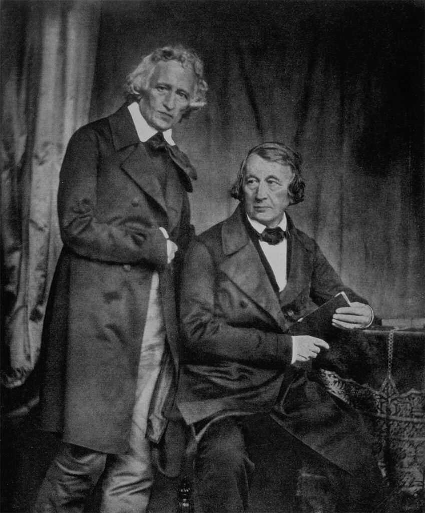
Dark Academia is a subculture and lifestyle movement that romanticizes the pursuit of knowledge, classical literature, and the idealized university experience. It is deeply rooted in nostalgia for a time before the digital age, valuing tactile objects like fountain pens, leather journals, and physical books.

The Psychological Hook: It appeals to a desire for depth and exclusivity. By framing learning as something mysterious or even dangerous (think secret societies and high-stakes intellectual rivalry), it makes the act of studying feel like an epic quest.

Visual Logic: The aesthetic relies on Chiaroscuro. The sharp contrast between light and dark. This is often achieved through dimly lit libraries or candlelit interiors, suggesting that discovery only happens in the shadows.

Color Strategy: It focuses on a monastic or scholarly palette:

Earthy Neutrals: Espresso brown, charcoal grey, and taupe to mimic old wood and stone.

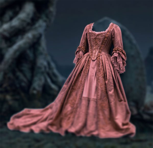
Dusty Accents: Forest greens, oxblood reds, and navy blues that look like they’ve been muted by age and dust.

Gothic Fantasy

The Intersection of Passion and Dread

Gothic Romantasy is a subgenre that blends high-fantasy world building with the brooding, emotional intensity of gothic romance. Unlike standard fantasy, the magic in this genre is often unsettling or tied to a curse.

The Psychological Hook: It functions as emotional catharsis. It explores forbidden or obsessive love within a setting that feels wild and out of control, allowing readers to explore intense themes of fate and survival from a safe distance.

Visual Logic: It uses The Sublime. The idea that something can be both beautiful and terrifying at the same time. You’ll often see vast, misty landscapes, ruined castles, or gnarled nature where the environment itself feels like a threatening character.

Color Strategy: This aesthetic uses emotional pops to signify life and passion amidst decay.

The Foundation: Deep blacks and cold greys to establish a sense of doom or mystery.

The Pulse: Colorful jewel tones like strawberry pink, ruby red, or emerald green. These colors aren’t just for decoration; they represent the human heart or the magic struggling against a dark, dead world.

Creepy Mirror
Hand Mirror
Knight on a balcony
Dark Doorway
Lady in The Night
Crow

The Uncanny Effect

The Liminal Environment

bc unicorn pink 2
This cover design subverts the standard Fairytale Transformation trope, which traditionally moves a character from a low location to a high location to signal progress. Instead, this design utilizes a Continuous Horizon across the entire cover. 
 
By keeping the graveyard, fog, and gnarled trees identical on both sides, I creates a Liminal Space. A place where time appears to have stopped. It is uncanny because it implies the Princess has never actually escaped the grave. The stillness of the environment suggests that the magic is stagnant and potentially cursed.

The "Living Void"

The primary psychological trigger is the manipulation of the brain’s evolutionary face-detection system. On the front cover, the brain establishes a human connection through the girl’s direct gaze. On the back cover, my design utilizes Shape Mimicry, presenting the ballgown as a rigid, upright form that retains the volume and posture of a human torso.
 
Because the dress is standing rather than slumped, the brain identifies it as a human silhouette but fails to find a face or hands. This creates a cognitive mismatch: the brain perceives a presence but finds a void. 
bc unicorn gray 2

The Design Logic

How I took an old world fairytale and turned it into a modern, moody aesthetic.

Color Strategy:

I implemented a 60-30-10 palette. 60% ash-grey for mood, 30% deep charcoal for depth, and 10% Strawberry Pink as an unexpected focal point.

Visual Hierarchy:

I engineered a Z-pattern eye-flow. I used the pink title-block to hook the viewer and the photorealistic dirty details to hold their curiosity.

Thematic Irony:

I positioned the author's name on a tombstone to metaphorically resurrect a dead version of the story.

Day-to-Night Transformation:

I used the front (day) and back (night) covers to represent the character's double life, moving from the reality of the grave to the disguise of the royal ball.

Market Impact:

This cover design successfully stopped the scroll by using subverted nostalgia.

Versatility:

The Aesthetic-First approach allowed the design to translate seamlessly into high-selling Etsy lifestyle products proving that the brand was stronger than the book.

Key Takeaway

It isn’t easy bringing a book everyone forgot back into the limelight. I took many risks here and I’m glad I did because it paid off. What I learned with this project is that patience key and persistence pays off.