NAMI Colorado Springs needed to break through the noise of mental health advertising. I was asked to create a campaign that didn’t just talk about support, but demonstrated what healing actually feels like.
So, why no faces?
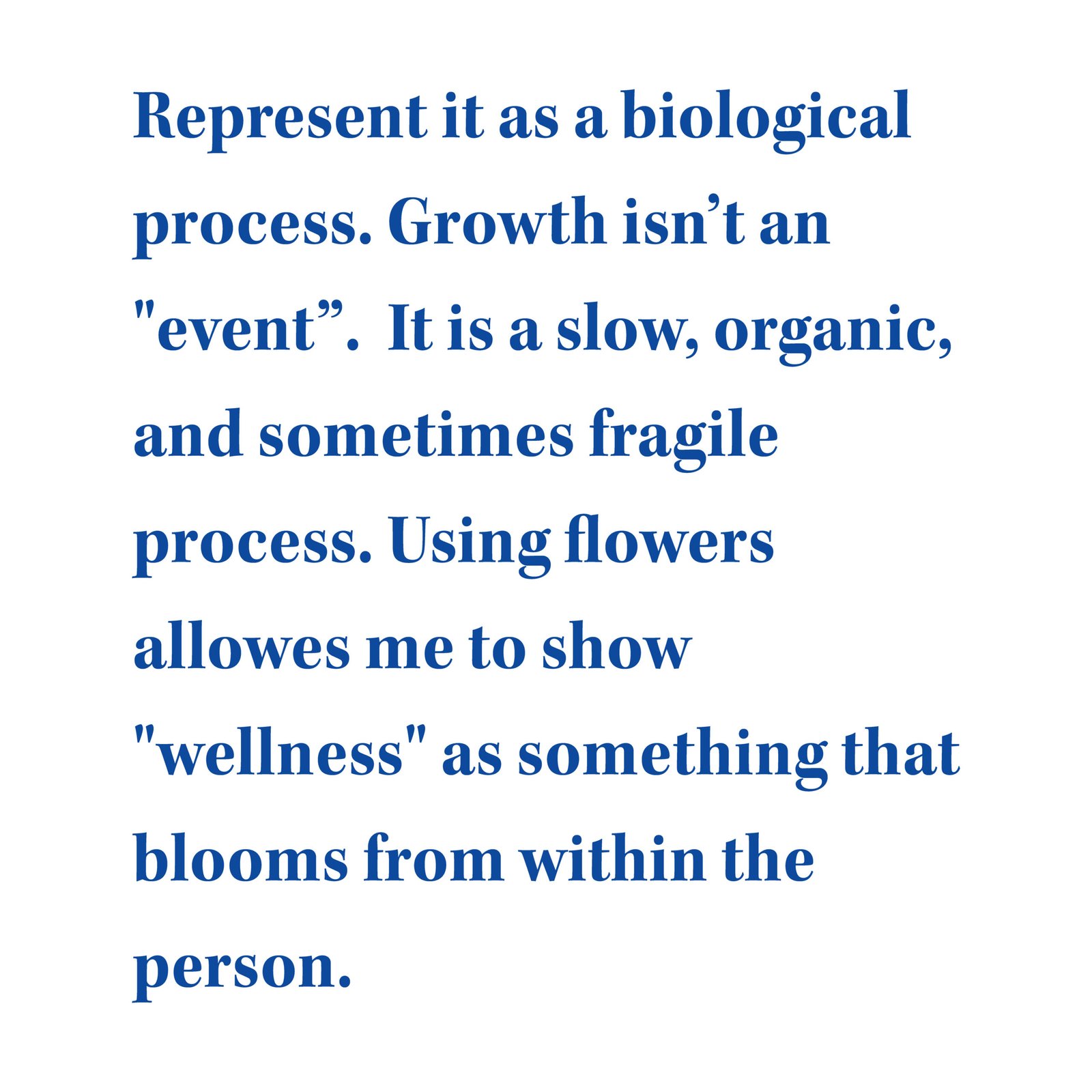
I threw out the standard sad faces and statistics playbook. Instead, I asked: Can I create deep emotional resonance without showing a single human emotion? By replacing our models’ faces with vibrant, species-specific flowers, I removed the stigma of the individual and replaced it with a universal symbol of growth.
The Human Process
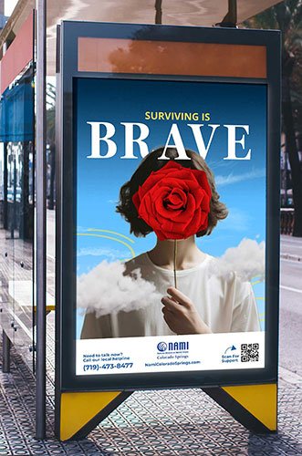
Using my perspective as an intentional designer, I stripped the campaign down to its core metaphors. I moved the art from high-up billboards down to the city’s manhole covers. Meeting people exactly where they look when they’re struggling: the ground.
The Goal
To move the conversation from masked to unmasked and to remind just one person that they are allowed to take up space and thrive.
(Scroll down for the full case study, from early research to the final city-wide unmasking.)
Current Market
How ManyProblemsAre there Really?
Finding TheGaps
Clinical & Statistical
The most common form of mental health advertising.
The vibe: rational, medical, and distant
Aggressive & Gritty
This style is Bold, but it uses high-stress triggers.
The vibe: angry, loud, and confrontational.
Positive & Generic
These are the "keep calm and carry on" style ads.
The vibe: soft, sunny, and often dismissive.
Art&Science.
The Baseline
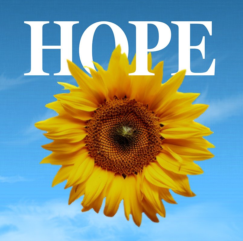
As the lead image for the campaign, this poster defines the visual and emotional standard for the entire project. I used a sunflower as the primary symbol because it represents a tough kind of hope, a sturdy flower that literally turns its head to track the sun every day. This isn’t a passive feeling; it’s an active, daily choice to face the light. The deep, golden palette was chosen to make the concept of hope feel heavy, real, and stable, rather than a fleeting mood that could float away.
Defines identity
Establishes trust
Anchors resilience
Commands attention
Unites messaging
Design For Vitality
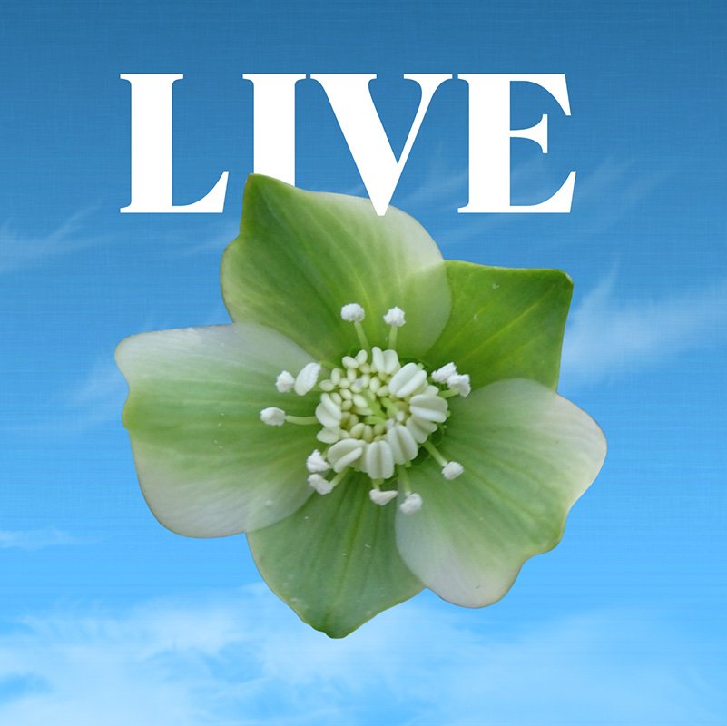
For this poster, I chose the Hellebore. A survivor species that blooms in the winter when other plants wither. It represents a life that is hardy and persistent, rather than just a temporary burst of energy. While Hellebores usually face the ground, I positioned this one to look up, mirroring the inward journey of mental health and the moment someone feels free to engage with the world again.
Paired with a restful, sage green palette, the design acts as a psychological green light. it tells the viewer that they can still thrive in the shadows and that recovery is about building a permanent, evergreen foundation that lasts through every season.
Restores balance
Signals safety
Promotes renewal
Encourages growth
Validates resilience
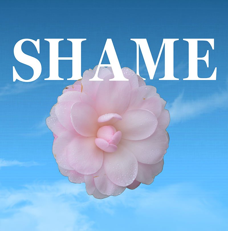
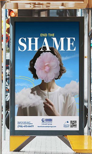
Design for Compassion
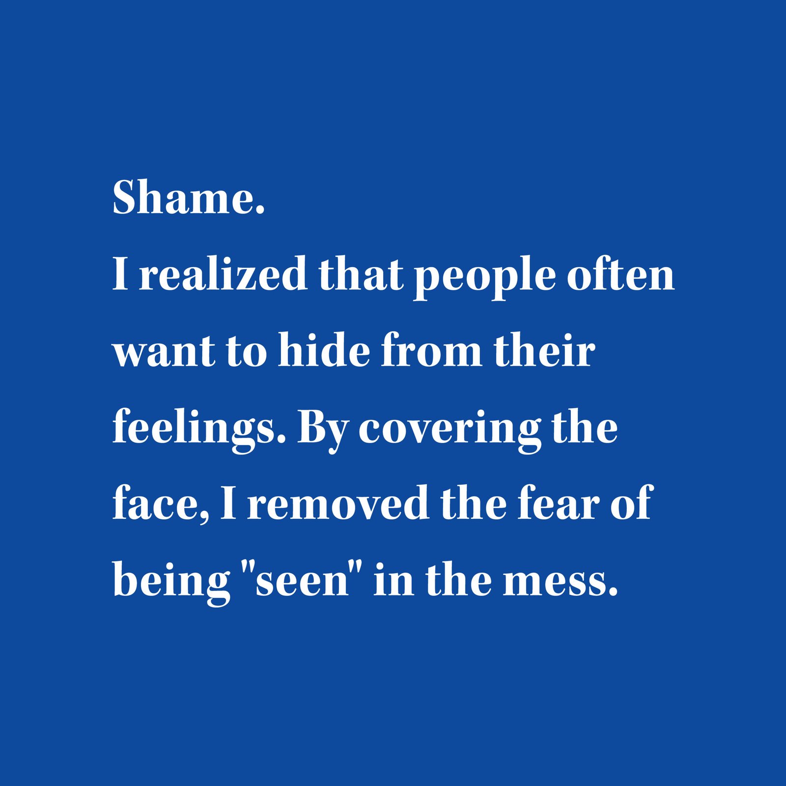
Shame is a cold, isolating emotion that often makes people want to hide behind a mask of being fine. I chose the Camellia because of its rigid, geometric perfection; it represents the Imposter Effect and the pressure we feel to look flawless even when we’re struggling.
By pairing this symmetrical flower with a soft, soothing pink, the design acts as a buffer for the nervous system. It’s meant to lower the viewer’s guard and suggest that the antidote to shame is self-compassion. The Camellia is a winter rose that blooms when the ground is frozen, proving that it’s possible to find beauty and value even in our coldest, most hidden moments.
De-escalates fear
Encourages openness
Validates struggle
Builds self-care
Breaks stigma
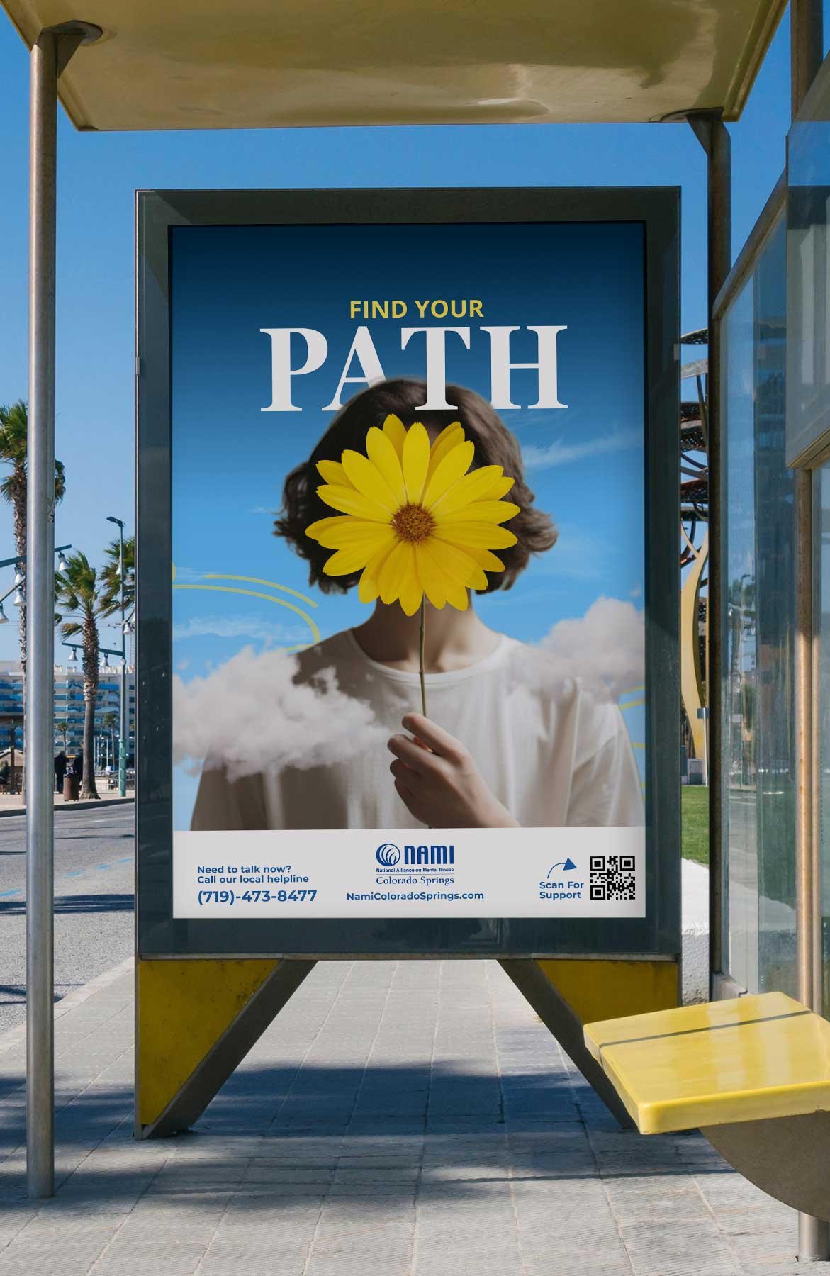
The Psychology of "Direction"
Mental health struggles often feel like being lost in a thick fog. I used a yellow daisy for this poster because it acts as a mental spotlight to cut through that confusion. Daisies are pioneer plants, the first ones to grow back on damaged or disturbed ground, making them the perfect symbol for a fresh start.
Its simple, radial symmetry works like a compass for the mind, pointing outward to show that a clear path always exists from the center. By using a bright, approachable yellow, I turned the scary unknown of recovery into a welcoming trail. It suggests that finding your way isn’t a high-maintenance puzzle; it’s a grounded, uncomplicated walk back to yourself.
Provides clarity
Signals direction
Reduces overwhelm
Invites action
Promotes optimism
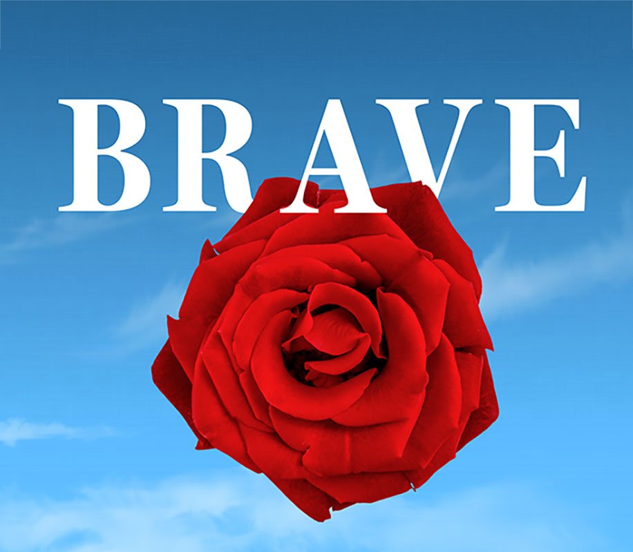
Bravery Takes Action
I used a saturated red rose for this poster to act as a startling heartbeat against the muted fog of depression. Red is the color of warriors and action, and by placing it front and center, the design communicates that surviving mental health struggles is its own form of combat.
I chose the rose because it’s a masterclass in duality; it has soft petals but is guarded by thorns, suggesting that true bravery is protecting your bloom despite the sharp realities of life. The tight, spiraling shape of the petals represents structural integrity and internal fortitude. It’s a command to take up space, stop hiding, and recognize that the act of surviving is a noble, heroic battle.
Commands attention
Triggers action
Validates strength
Elevates survival
Inspires fortitude
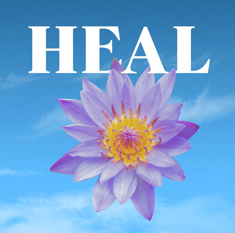
Transform To Heal
I chose the Lotus for the word HEAL because it is the ultimate symbol of the impossible journey. A lotus roots itself in thick, anaerobic mud and pushes through murky water to reach the sunlight, proving that the mud of trauma isn’t a barrier, but the nutrient that makes the bloom possible.
The purple palette acts as a psychological bridge, mixing the soft lavender of peace with the calm blue of logic to create a state of composed energy. Because lotus petals are naturally self-cleaning, the design represents the stage where the stigma of a diagnosis no longer sticks to you. It’s a visual deep breath that signals the chaos has been replaced by a new, hard wired endurance.
Signals resolution
Restores intuition
Promotes balance
Validates wisdom
Celebrates growth
Color ChangesYour Mood
Color is more than just a decoration; it’s a tool that shifts how we feel and act. By using specific tones, we can actually lower stress, spark energy, and help the mind find its way back to a calm state.
A Unified Voice.
CONSISTENCY
Mental health awareness only works if the message is clear and recognizable across every platform. By sticking to a strict system of typography, colors, and nature based imagery, I made sure the NAMI campaign felt like one continuous conversation.
Spread The Word
This trifold brochure was designed to be a clear, reliable resource for anyone looking for local support. I focused on a highly readable, accessible layout that makes finding group times and contact info quick and stress free. It’s built to bridge the gap between seeing a billboard and actually reaching out for help, providing a quiet, private way to explore NAMI’s services.
MeetPeopleWhere They Are
This phase took the message directly to the streets using social media carousels and sidewalk guerrilla art. By placing vibrant, unavoidable flowers in high-traffic city spots, we can turn everyday urban surfaces into a conversation about mental health.
My Takeaways
Reflecting on theImpact.
With so much stigma around mental health, most campaigns try to be “in your face” or “unique” in some way or another. memorable. what I learned during this process was that getting back to the place we all come from and removing the focus on the person and putting it on the process, made the campaign lighter and more grounded.