The Mission: Here In El Paso County, Colorado, support for autistic adults is scarce. A woman who was diagnosed with Autism in her mid-thirties, found herself in a “resource desert.” Rather than waiting for someone else to fix it, she created a personal necessity that turned into a county-wide movement.
My Strategic Approach: I didn’t just build a website; I built a visual world where neurodivergent adults finally feel at home. I intentionally rejected the clinical symbolism of the past. Instead, I delivered a brand that is grounded, retro-inspired, and unapologetically honest. From the Error Man mascot to a snarky, transparent brand voice, I’ve created a community identity that is the direct opposite of stale.
The Perspective
Support Cliffs &Broken Narratives
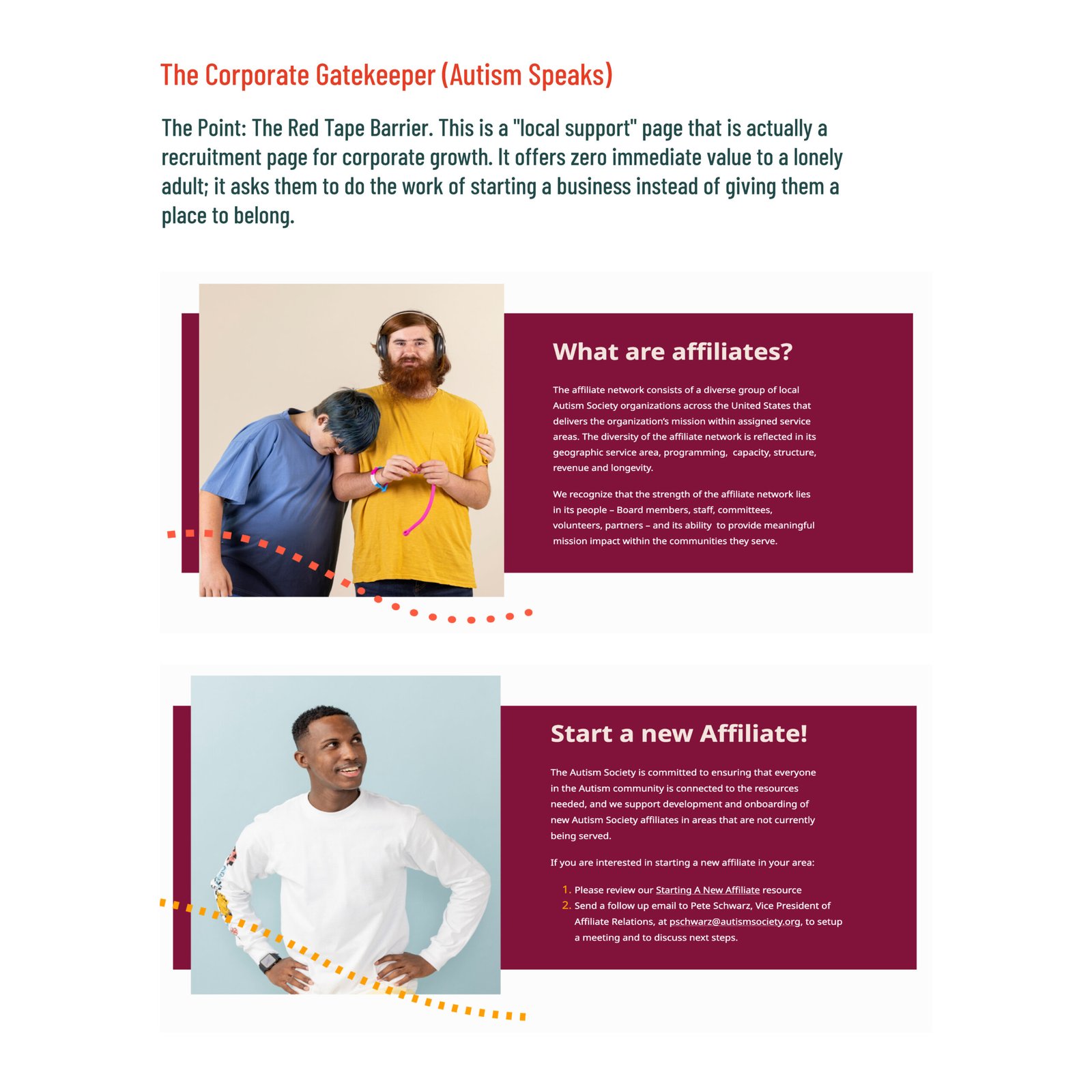
The problem: My research into the existing landscape for adult autism revealed a bleak, unsupportive environment. We found four core failures in how the industry currently communicates.
The Challenge: How do we build a brand for the only support group in the county that treats adults like adults? How do we create a space where existing is enough, and where human is the only spectrum that matters?
Scroll Up
Turning 18 and falling off a cliff
Most support structures vanish the moment an autistic individual becomes an adult, leaving them isolated in an environment depleted of resources.
The stigma
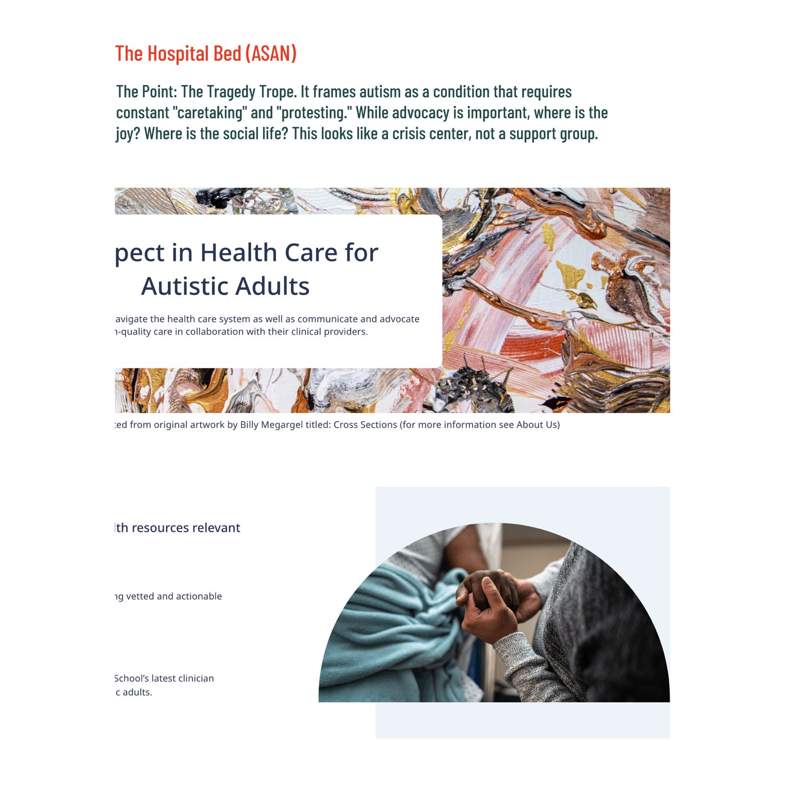
Typical branding relies on somber, clinical imagery and language focused on fixing people. It frames the autistic experience as a tragedy to be managed rather than a life to be lived.
Community of barriers
Many existing resources are locked behind hoops people have to jump through. These include: counseling, sign-ups, and costs. This simply reinforces a dynamic that the normal person is helping the helpless one.
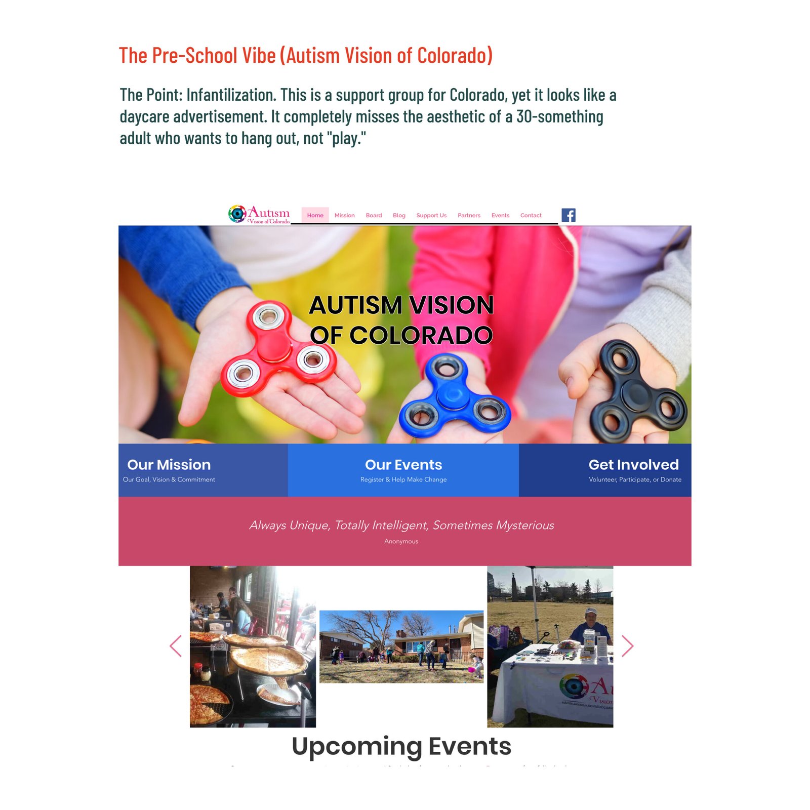
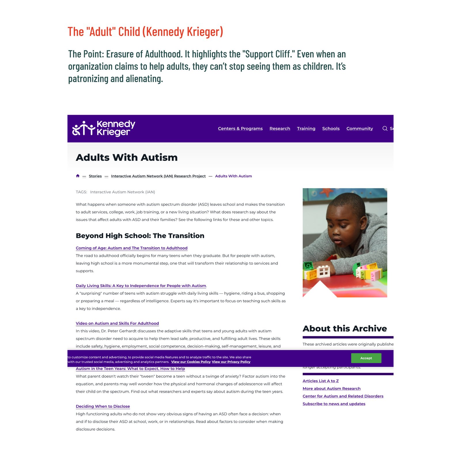
You're sick
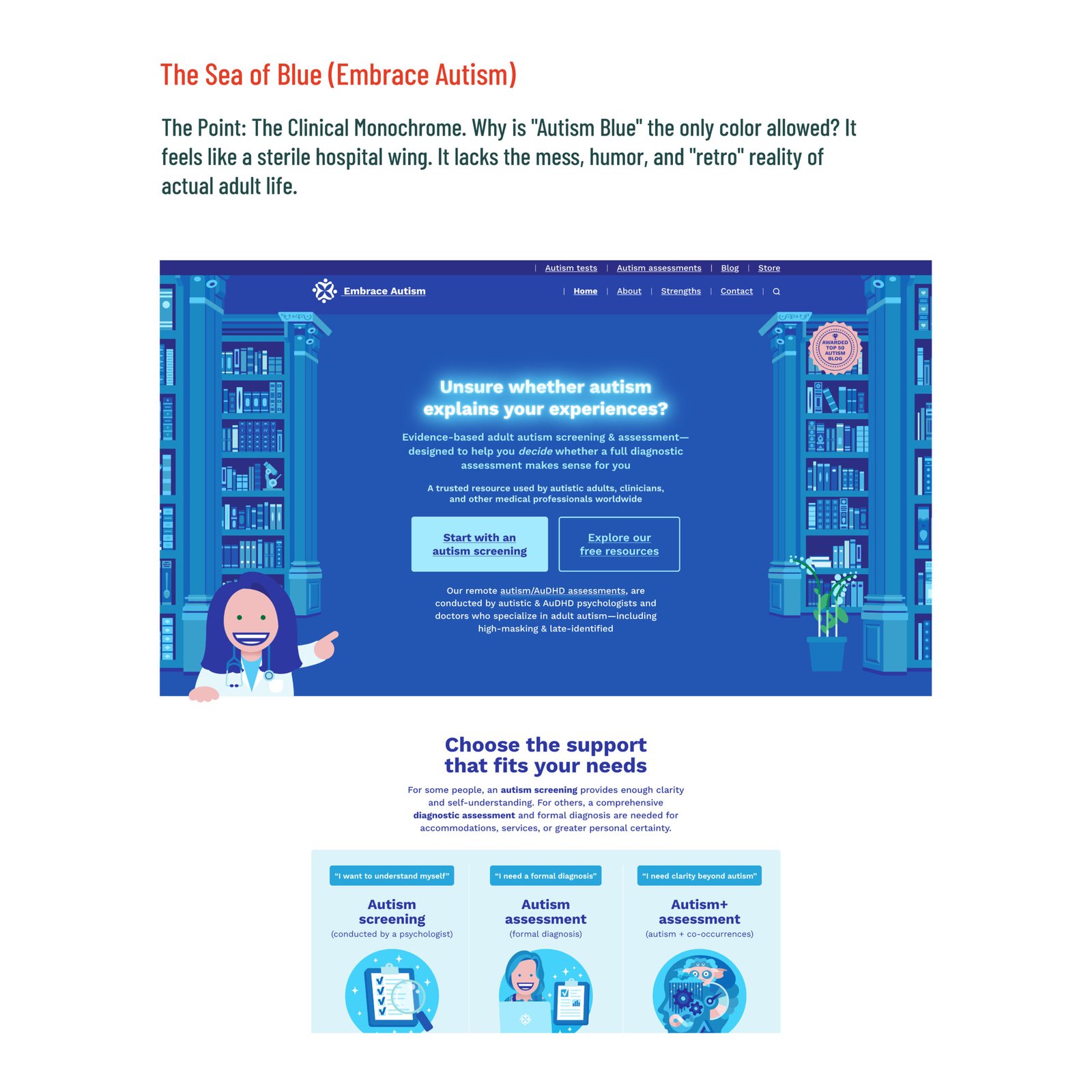
Many organizations use a visual language that is either hospital-grade sterile (all white/blue) or preschool-playful. This signals to the adult that they are entering a clinic for treatment rather than a community for connection.
Autism Vision
Kennedy Kreger
ASAN
Embrace Autism
Autism Speaks
Us VS. Them
Identifying theGap in Adult Resources
The Industry View: A Lot of(Stigma)
For decades, the Autism Spectrum has been incorrectly marketed as a linear scale, moving from Low Functioning to High Functioning. This clinical model is not only inaccurate; it’s damaging. It traps adults in boxes that prioritize their usefulness to society and invalidates their experience.
Our Agency’s View: The Human Reality
We rejected the line and embraced the wheel. Our Reality model recognizes that neurodivergence is a constellation of traits: sensory, social, and cognitive, that shift and change. By shifting the visual language from a rigid line to a dynamic circle, we removed the pressure to be normal and replaced it with the freedom to be human.
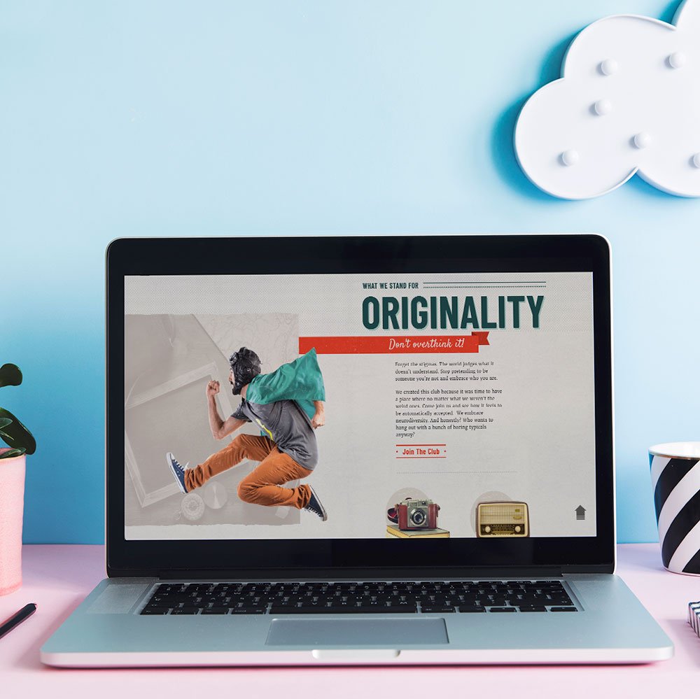
Design Strategy
Design ThatIgnoresthe Rules
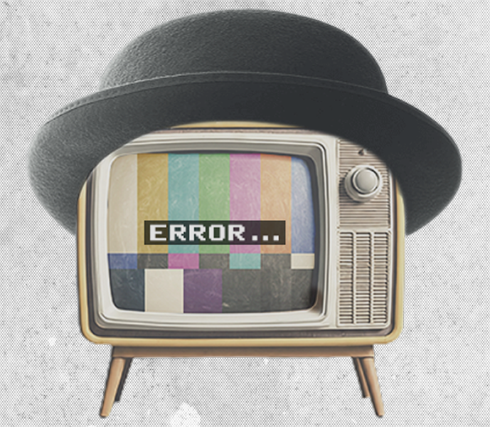
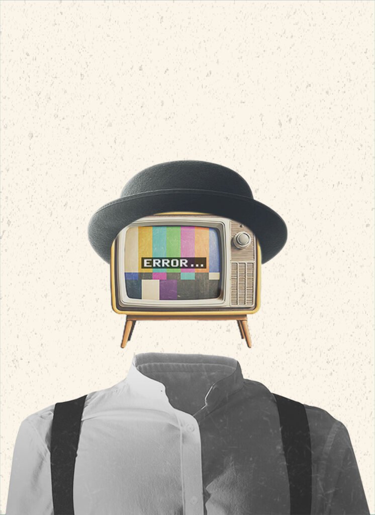
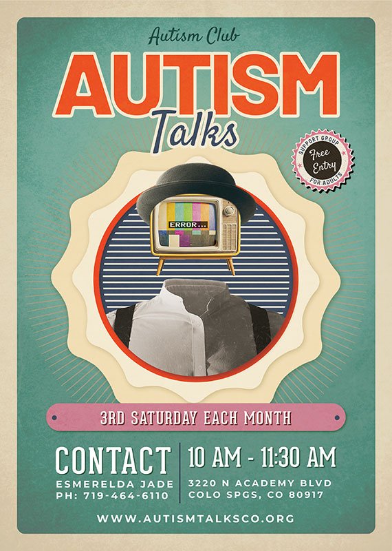
The Mascot for Autism Talks
Error Man
The Metaphor of the “Error” In a world obsessed with fixing neurodivergence, we chose to center the glitch. Error Man is an everyday man with a TV for a head displaying a permanent “ERROR” message. This serves as the primary visual metaphor for the autistic adult experience. He represents the moments of social processing fatigue, sensory overload, and the feeling of being out of sync with a neurotypical world.
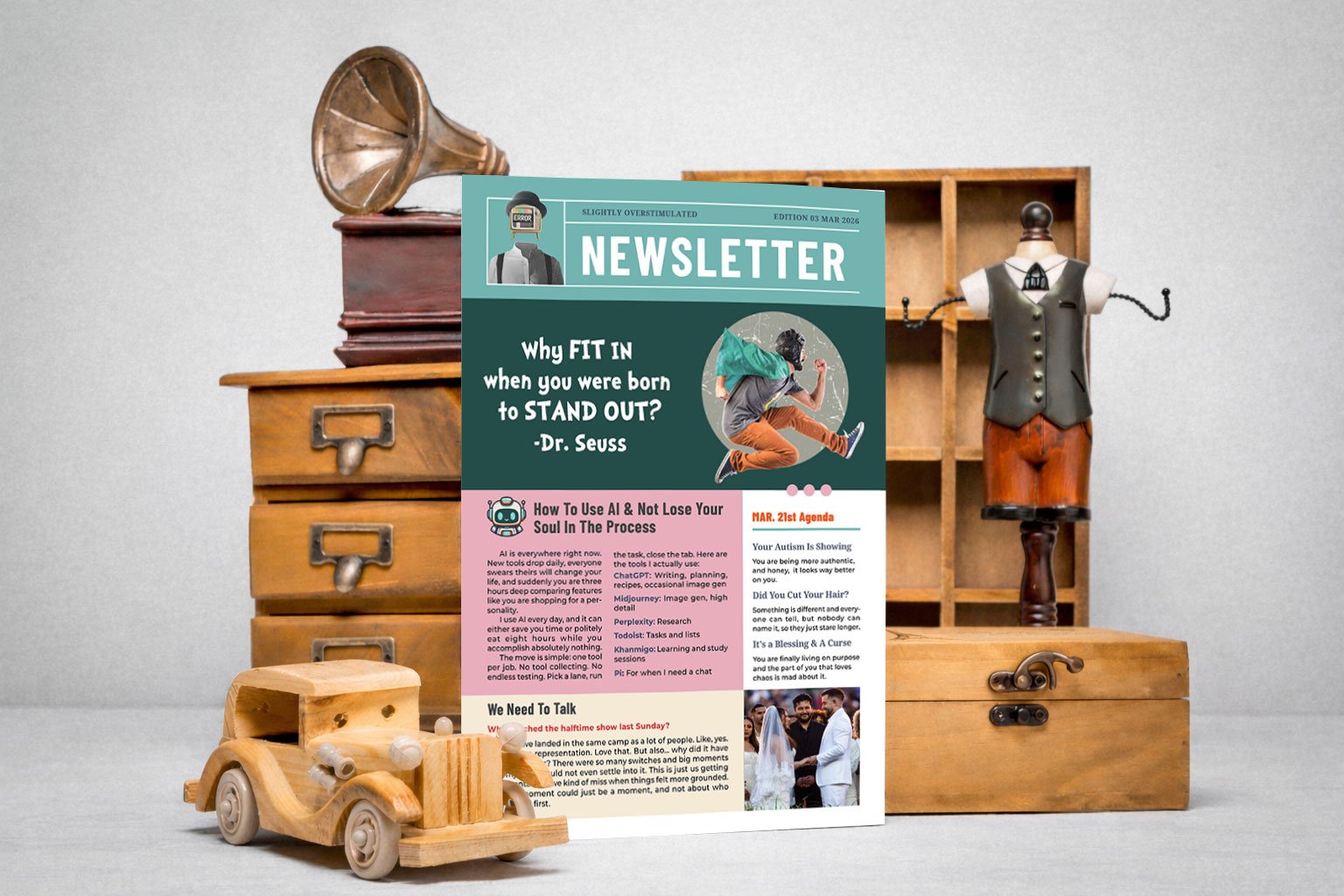
A Mascot for the Unfiltered Self I intentionally utilized a high-contrast, analog aesthetic to distance the mascot from the soft, immature cartoons often associated with autism resources. His presence across the website, monthly newsletters, and county-wide flyers provides a consistent sense of visual safety.
Reclaim The Stigma
Adult Space Signal
More Than Just A Support Group
Find Your Identity
Let’s be real: most support for adults is a clinical box-ticking exercise. I built something different. By ditching the hospital-blue walls and patronizing jargon, we’ve created a visual world that finally matches the intelligence and complexity of the neurodivergent brain. Our mission is to provide the one thing El Paso County was missing: a place where normal isn’t the goal…existence is.
Deliverables
Turning A Woman's Vision Into Colorado's Reality
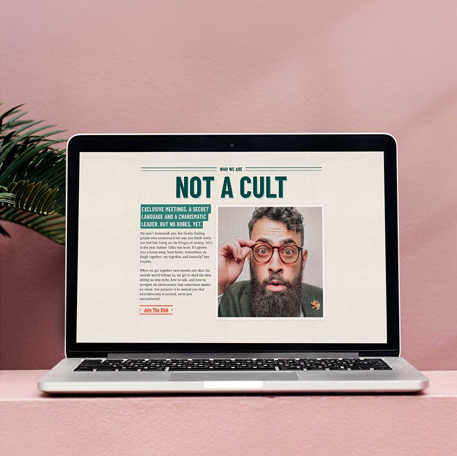
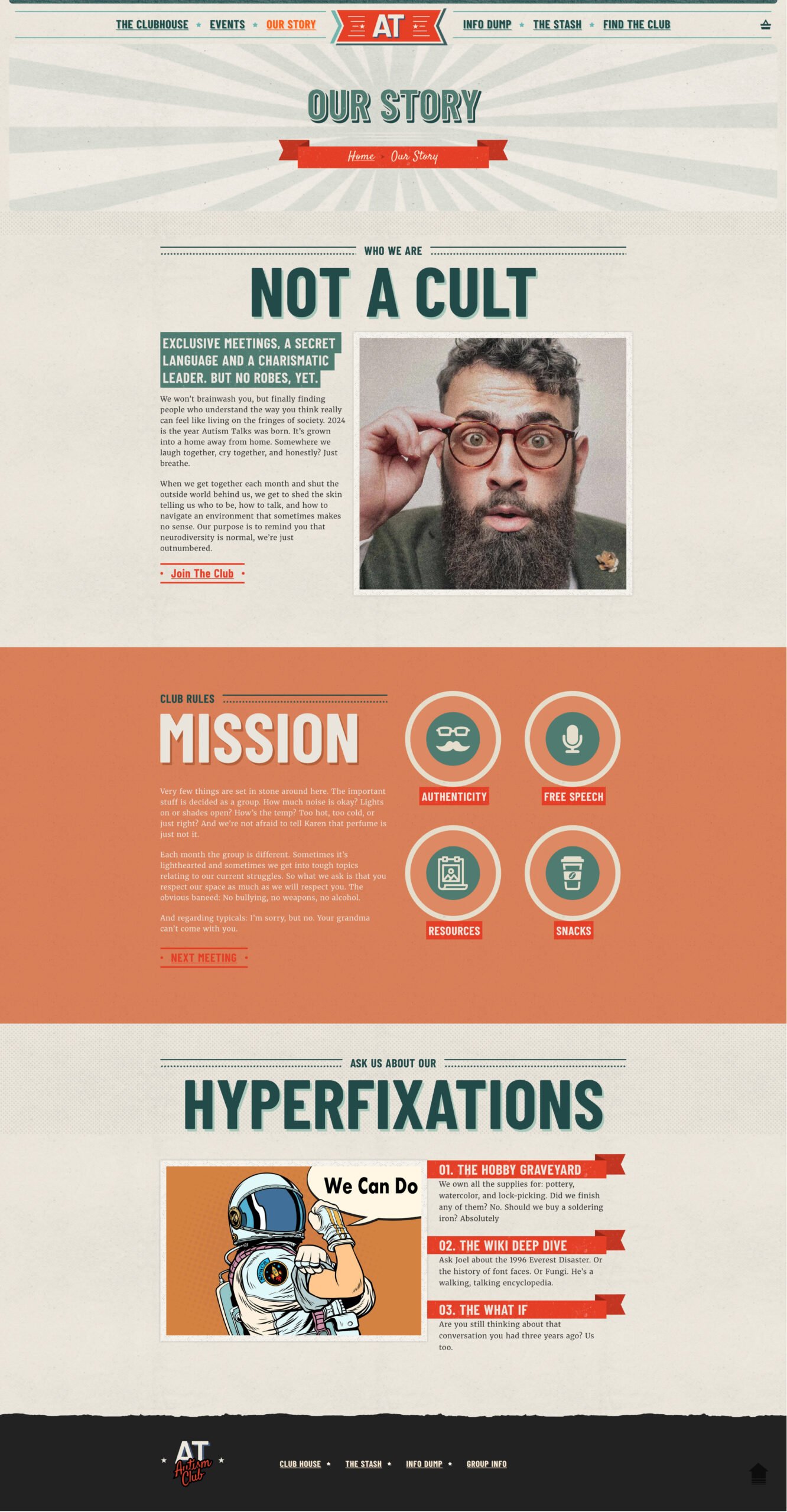
Not A Cult
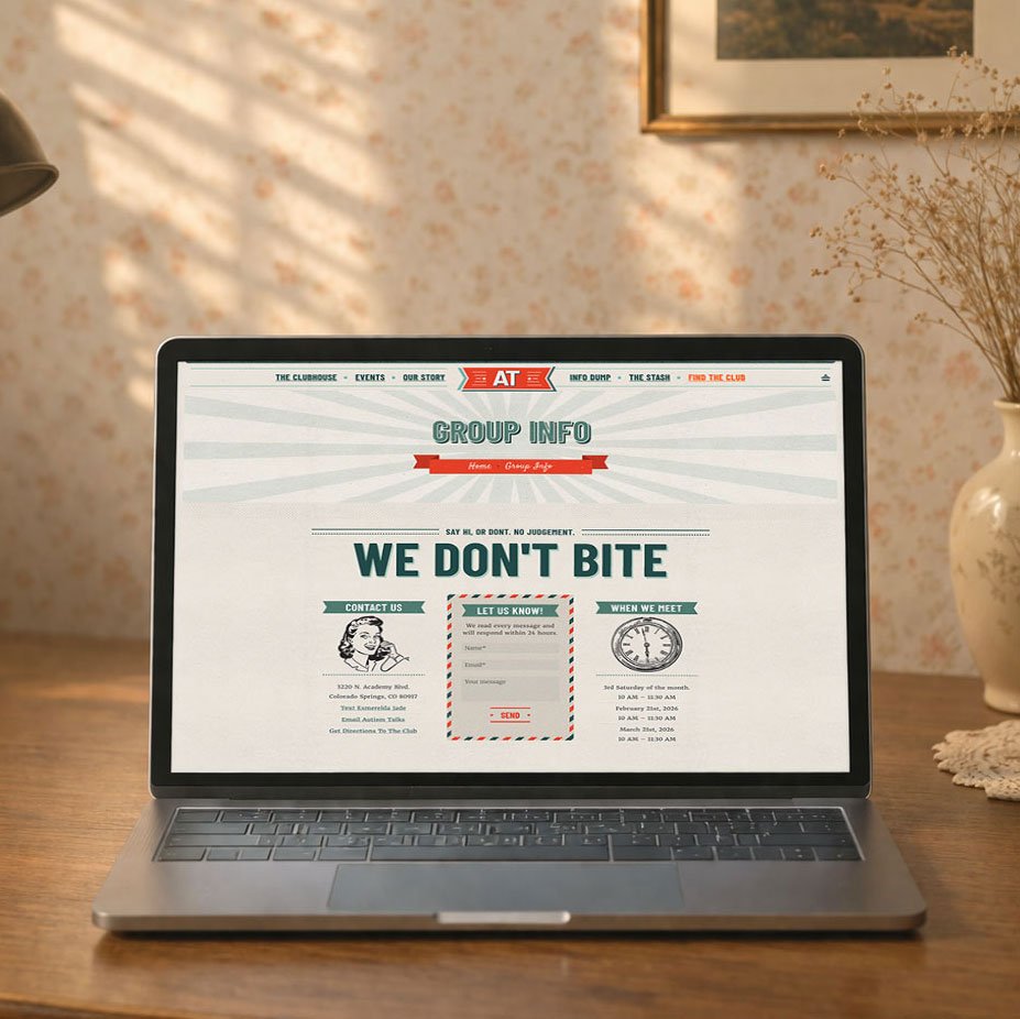
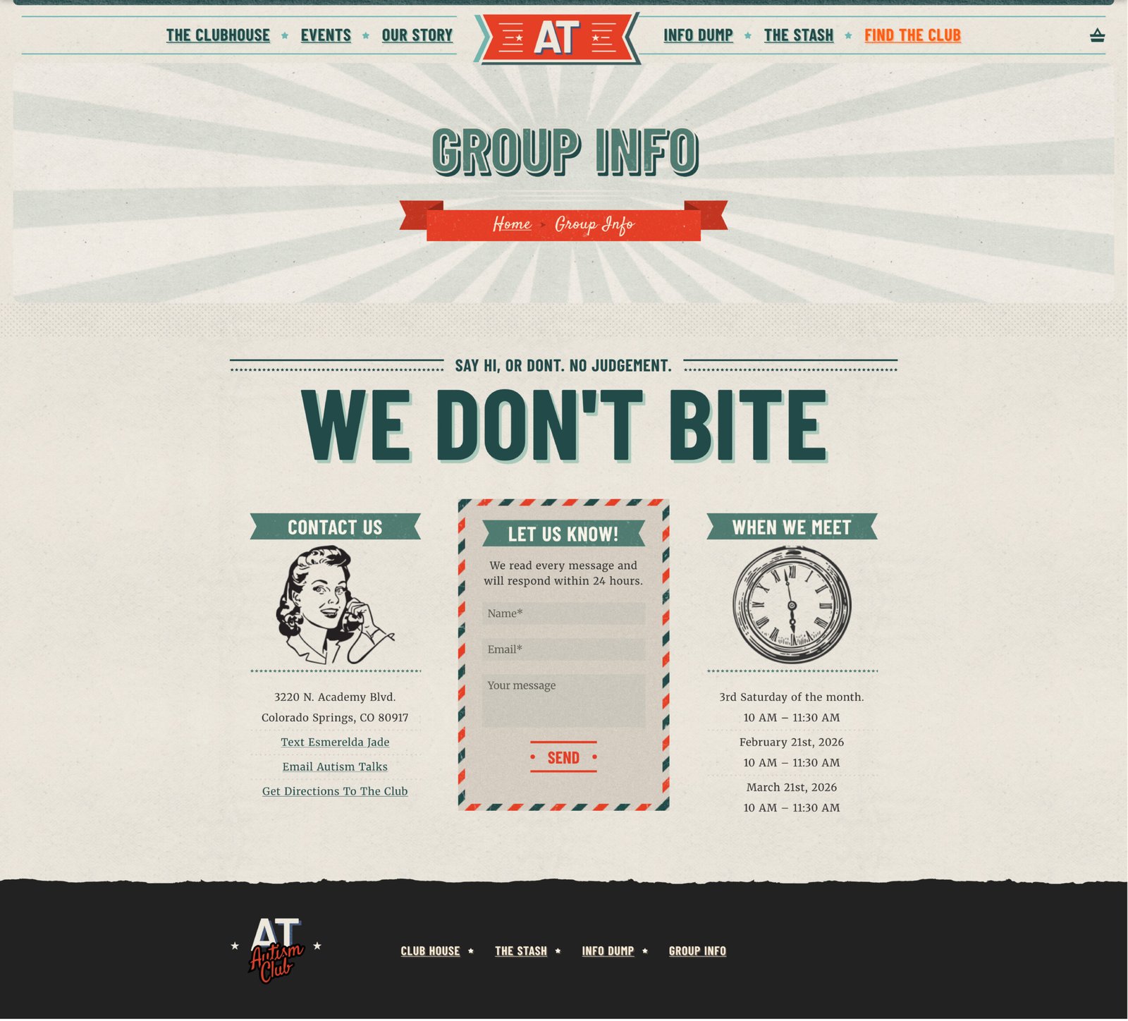
The Clubhouse
A no fluff community page for the neurodivergent brain. No jumping through hoops here. This is just a grounded, welcoming space designed to make joining a group feel less like a doctor’s appointment and more like coming home.
Info Dump
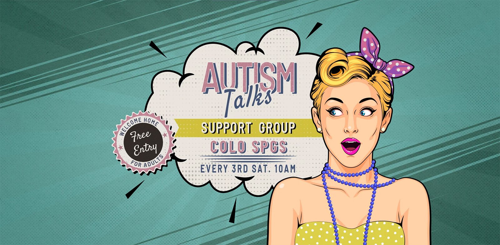
The Flyer
A website is only effective if people know it exists. To reach the isolated adults of El Paso County, I designed a flagship flyer that acted as a literal beacon in local libraries, colleges, and treatment centers. By combining the mascot with clear, high-contrast typography, we created a piece of collateral that stood out in cluttered community spaces.
The response was immediate and overwhelming. It was shared rapidly across the county. The success of this flyer proved our core theory: if you build a world that treats people like people, they will show up.