A bad day of deer hunting still beats a good day at the office.

360 Outdoors

Building A Community From The Gound Up.

The Mission

360 Outdoors

The Core Vision

The Strategy

Brand Values

How We Work

The Toolkit

Deliverables

The Final Gear

The Uphill Climb

Problems

Inconsistency Across Platforms:

Ensuring logos, colors, and typography are unified across digital, print, and physical spaces to avoid confusing audiences.

Lack of Differentiation (Standing Out):

Creating unique identities that clearly distinguish a brand from competitors, ensuring they do not look alike or feel interchangeable.

Outdated or Irrelevant Brand Identity:

Modernizing visuals for a new target audience or to better reflect changes in the company’s mission, values, and overall direction.

Lack of Versatility and Functionality:

Designing a logo that works equally well on a tiny website favicon, a business card, and a large truck wrap across all formats.

Poor Communication of Brand Values:

Ensuring the design instantly conveys the brand’s personality (e.g., luxury vs. budget, serious vs. playful) in a clear and intentional way.

Limited Brand Recognition:

Overcoming low awareness by building a cohesive visual system that makes the brand immediately recognizable and memorable across platforms.

Lack of Emotional Connection:

Utilizing psychology in design to create a visual identity that resonates with the audience on an emotional level, building trust and loyalty.

Challenges

Client Vision vs Strategic Direction:

The client initially preferred a simple, calm, circular logo, requiring a shift in perspective to support a more bold and differentiated direction.

Gaining Buy-In for a Non-Traditional Concept:

Introducing a character-driven identity in a typically serious, minimal industry required building trust and clearly justifying the creative direction.

Industry Norms Limiting Creative Freedom:

The outdoor and hunting space heavily favors safe, predictable branding, creating resistance to more expressive or personality-driven visuals.

Production and Embroidery Constraints:

Logo details had to be carefully considered to ensure they could translate cleanly onto apparel and physical merchandise.

High-Speed, Long-Distance Visibility:

Billboard designs needed to communicate instantly to viewers in motion, limiting how much information and detail could be included.

Condensing Complex Information:

Hunting packages, pricing, and services had to be simplified into clear, quick-hit messaging across flyers and brochures.

Designing for Uncontrolled Environments:

Materials needed to remain legible and effective across outdoor conditions, varying lighting, and different viewing distances.

Oh Deer!

Where is the Originality?

The outdoor space is full of brands that look like they came from the same template. Same symbols, same structure, same tone. It makes everything blend together, which opened the door to do something completely different.

logo that says deer hunter. deer silhouette in front of a moon

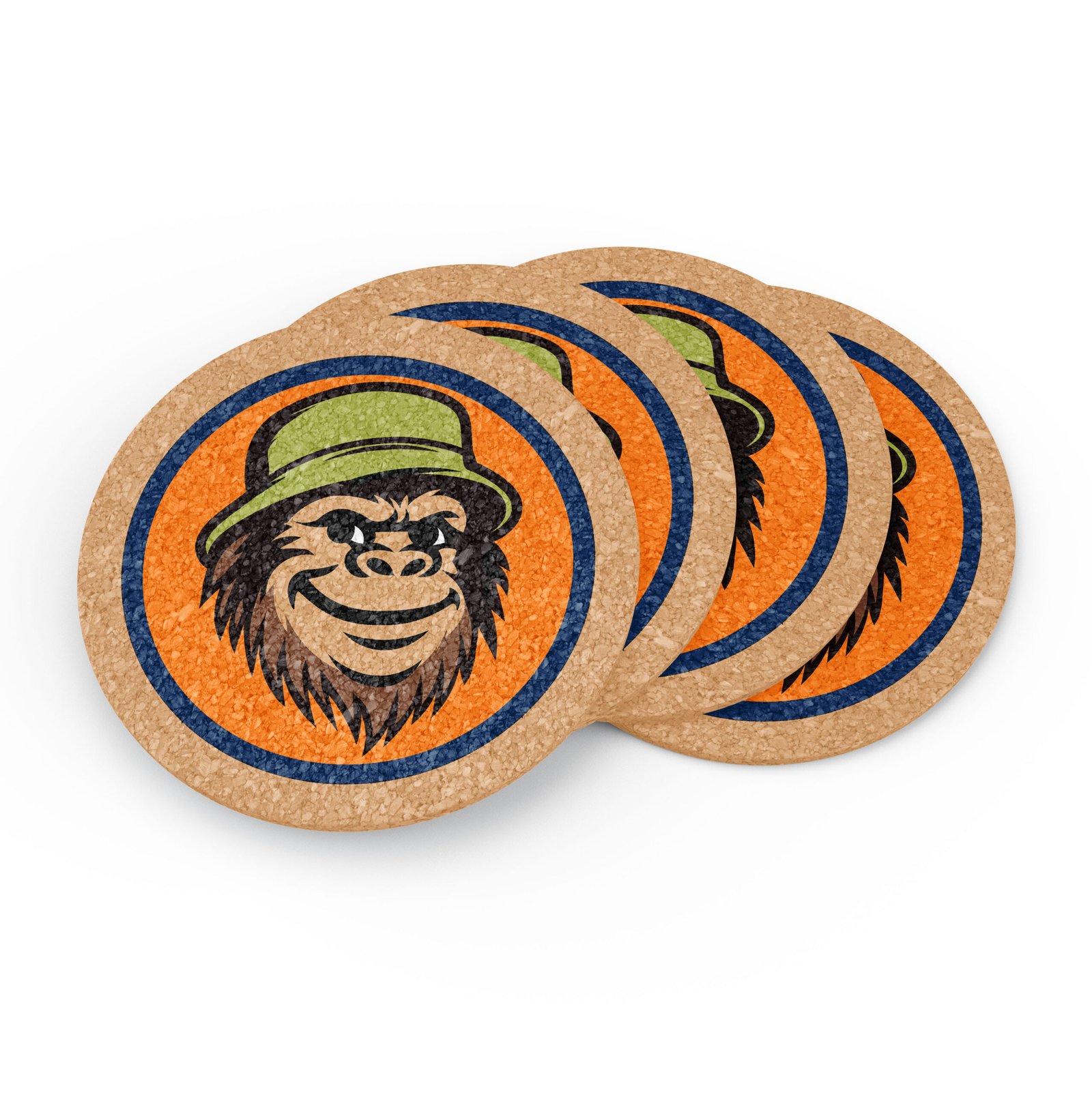
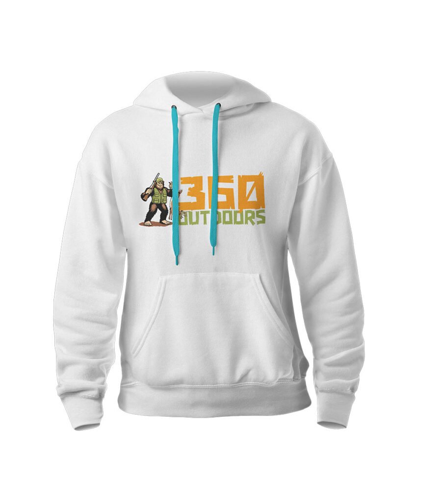
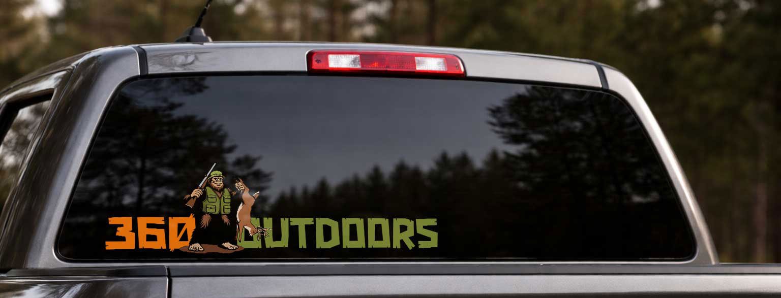
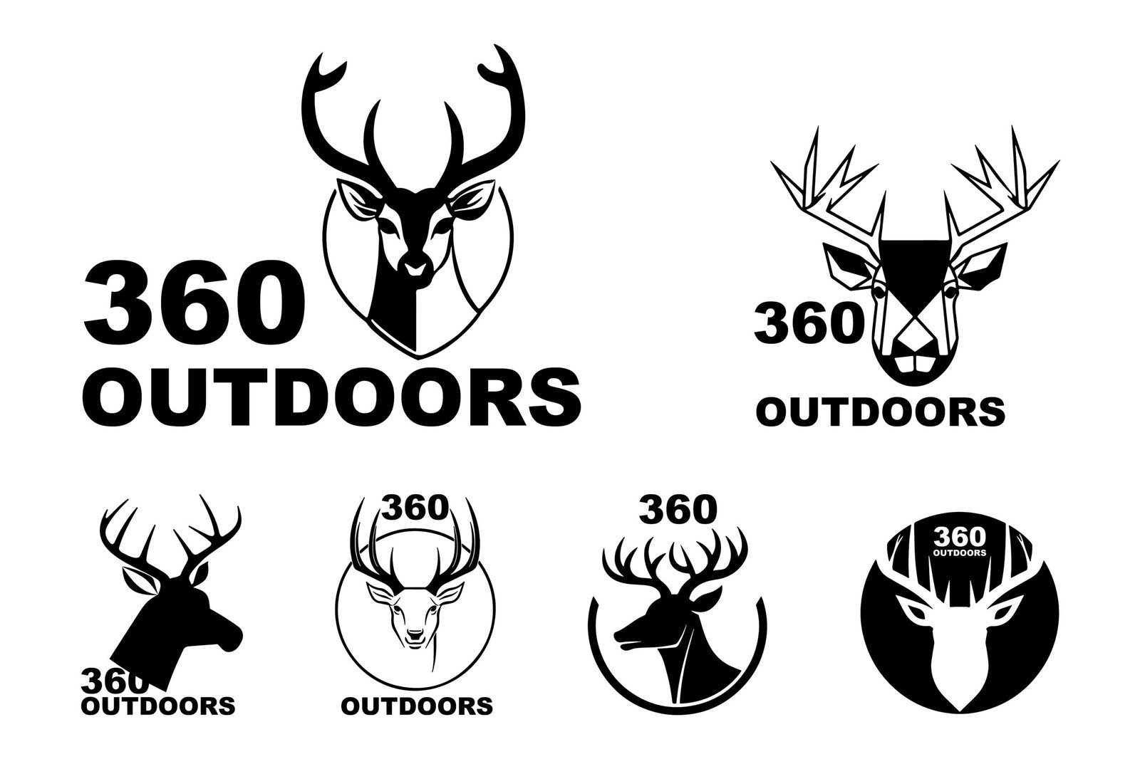
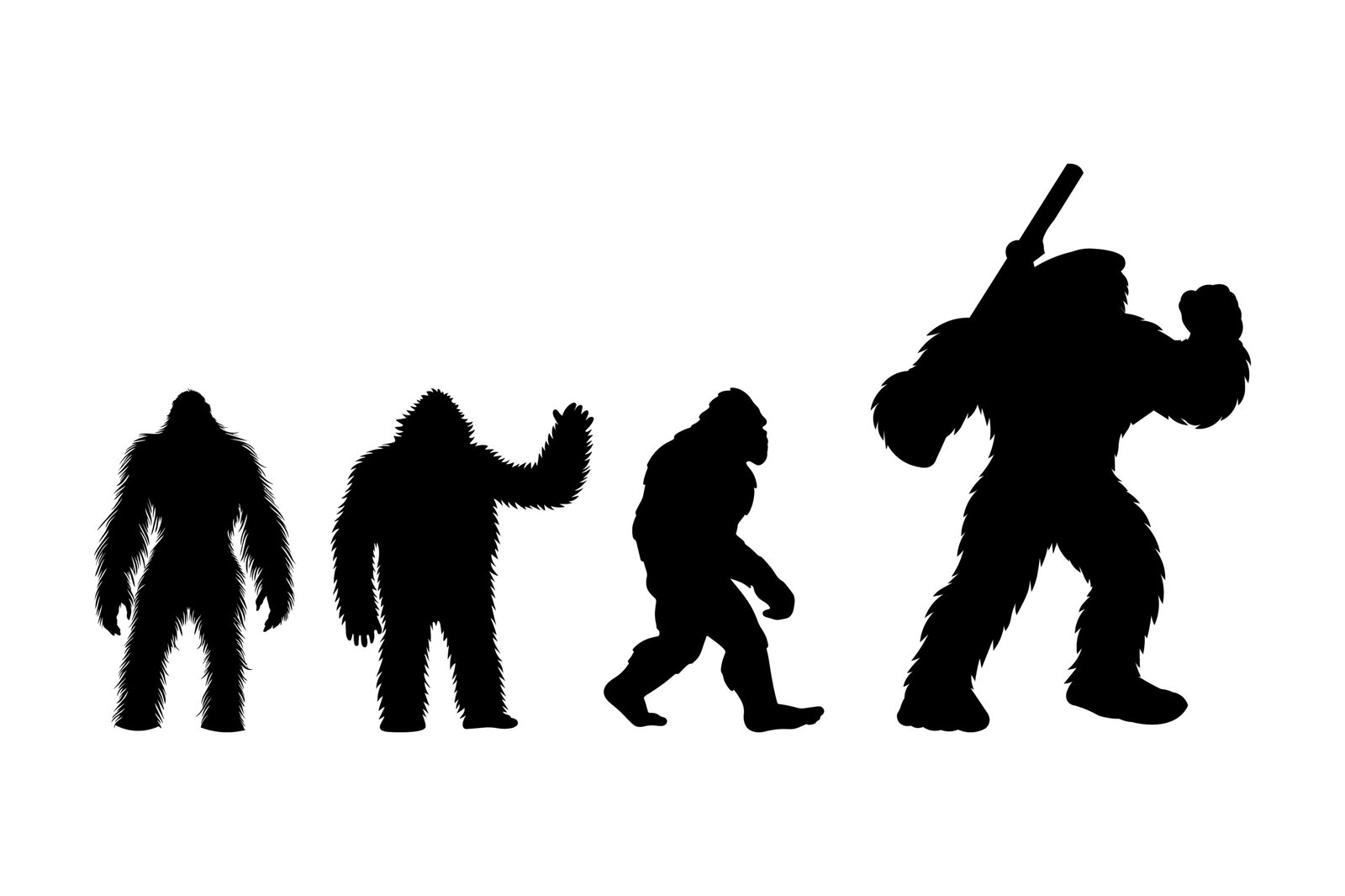
Same symbols everywhere

It’s deer, antlers, or some kind of wildlife almost every time. You can scroll past a dozen brands and they all start to blend and blur together.
Buck slayer logo. deer head with text buck slayer to the right

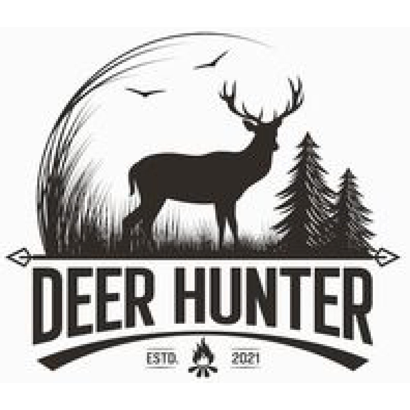
Saying exactly what it is

A lot of brands just say what they do and match it with the same visual. It gets the point across, but there’s nothing that really sticks with you.
outdoor logo. two deer and two guns shaped in an "x"

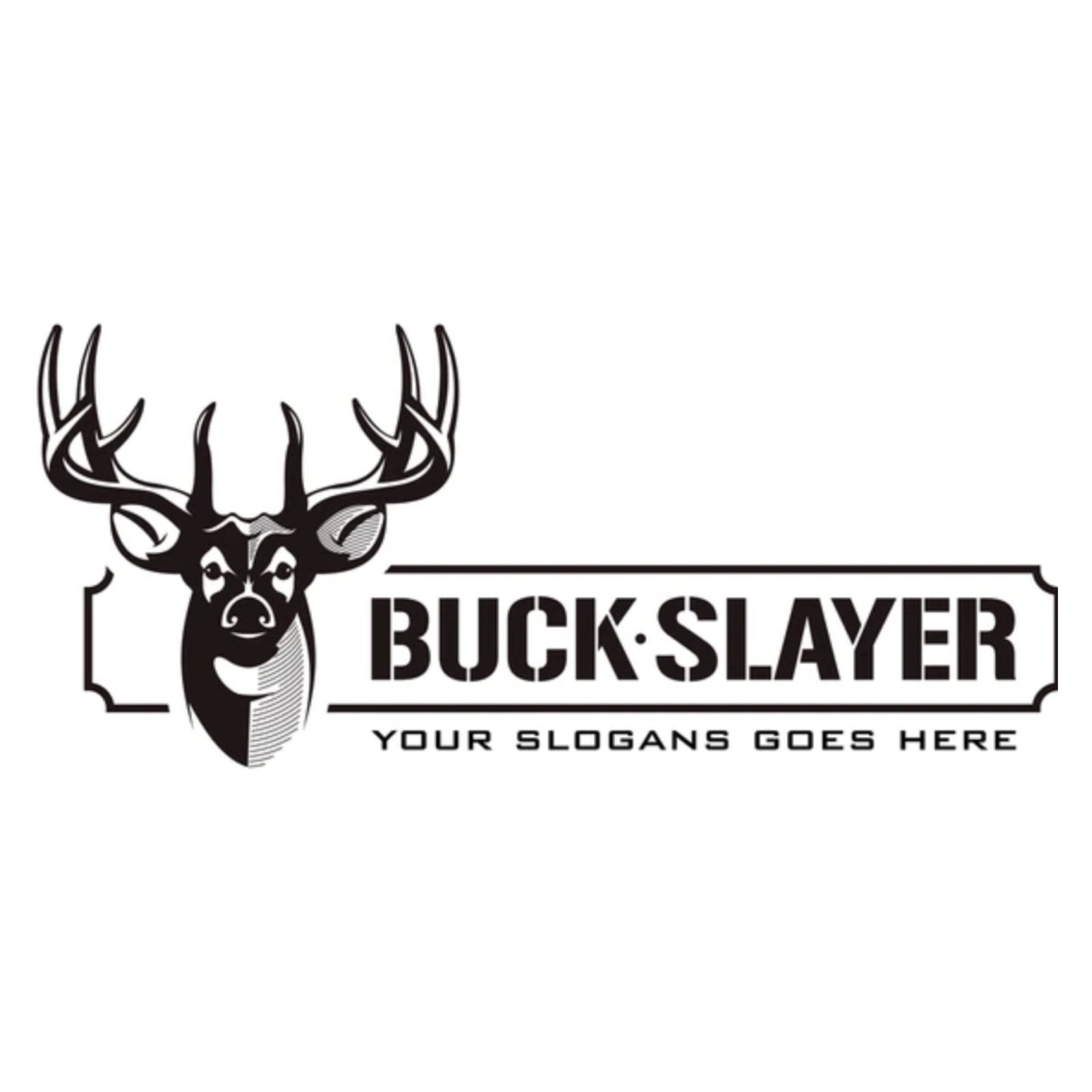
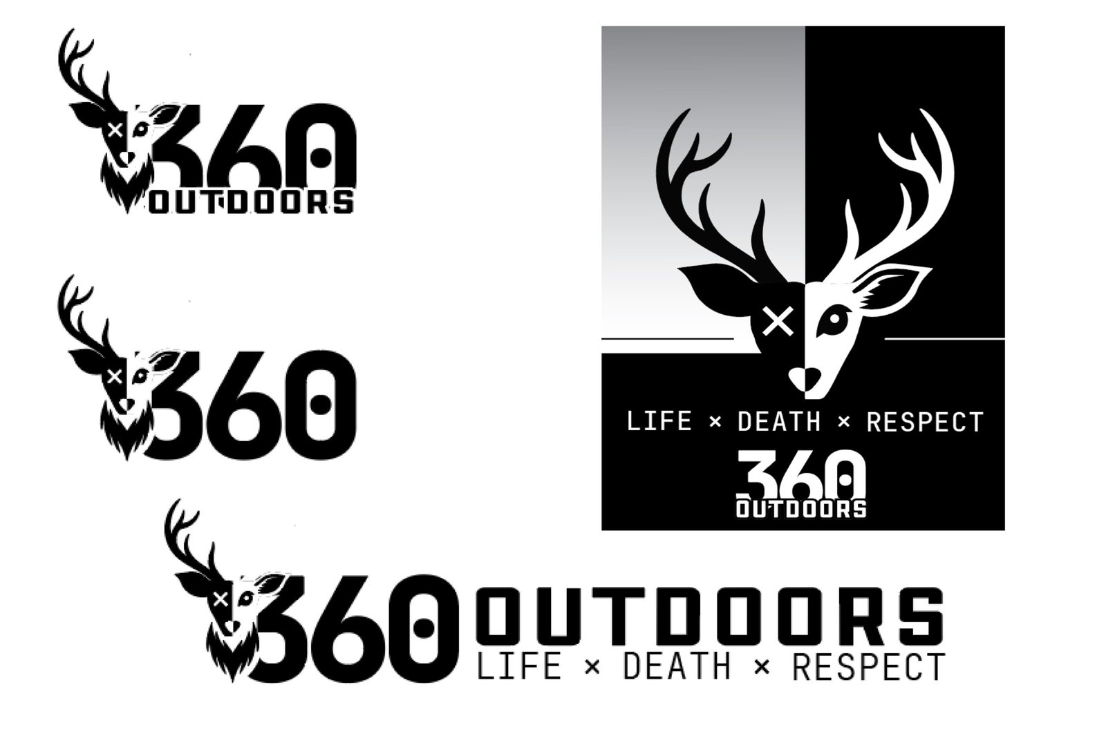
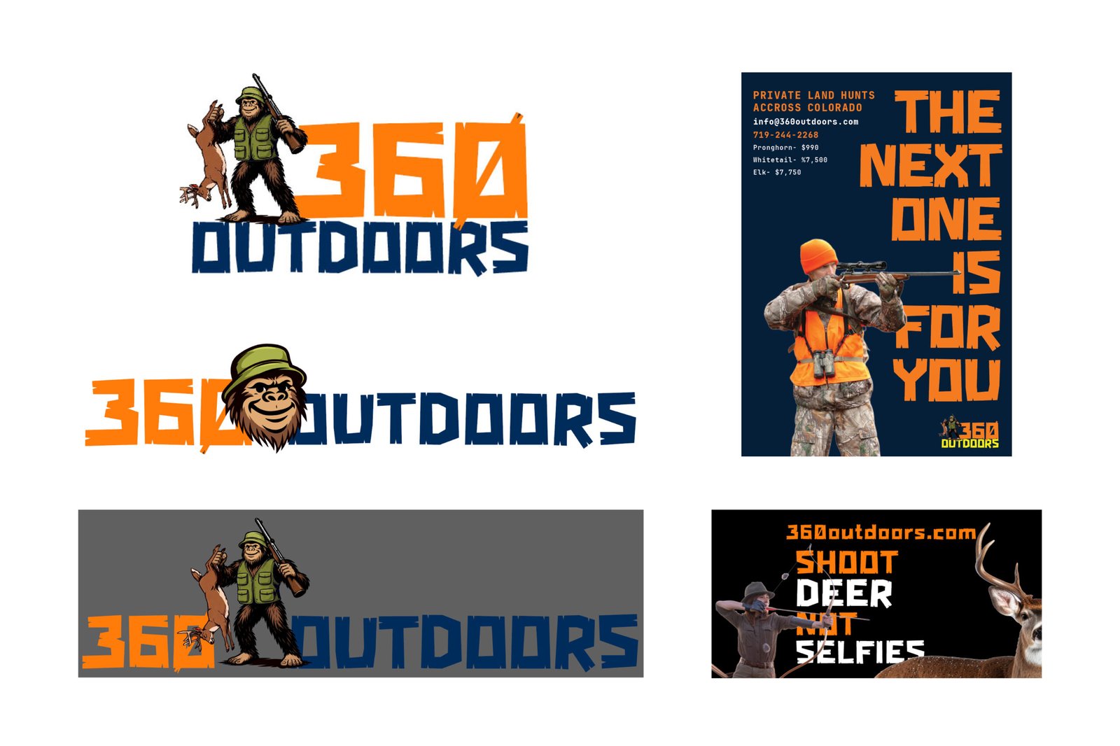
Badge After Badge After Badge...

The badge style logo shows up over and over. Same shape, same layout, just slightly different details and variations.
Deer silhouette behind a set of two mountain peaks

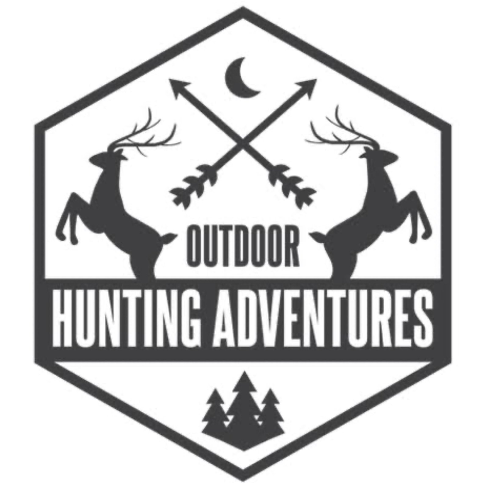
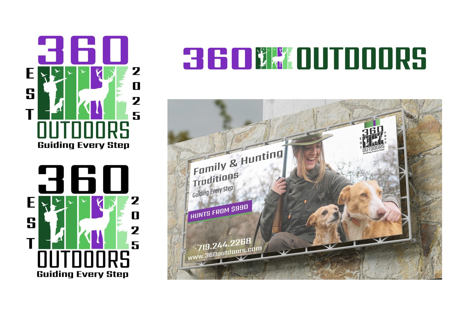
Just stack the same ideas

Mountains, trees, deer… all combined into one logo mark. It ends up feeling like a remix of the same concept.
compas with mountains in the middle

Only use safe color choices

Everything leans into dark greens, browns, and neutrals. It fits the space, but it also makes everything feel the same.
the word adventure with a compass shape and mountains behind it

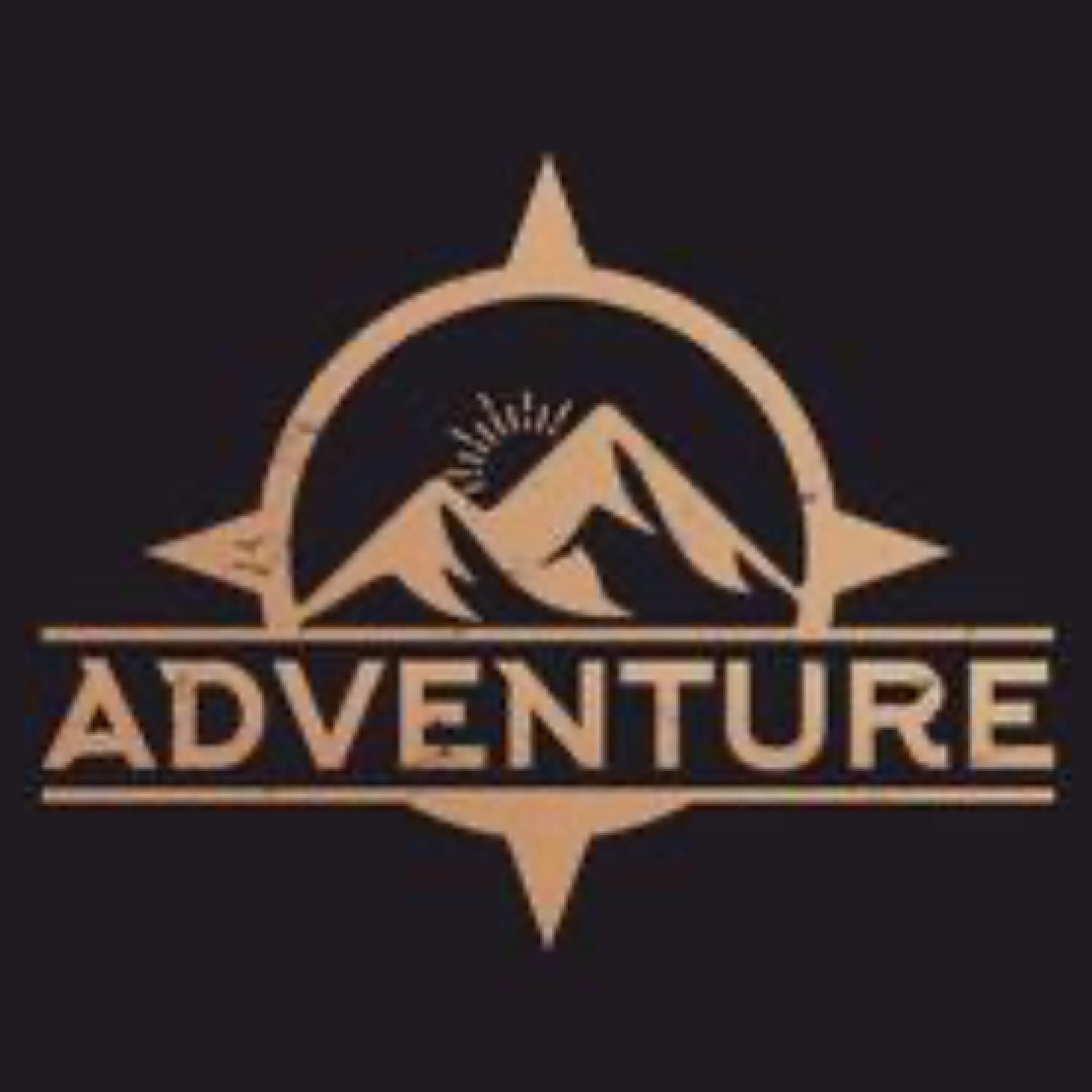
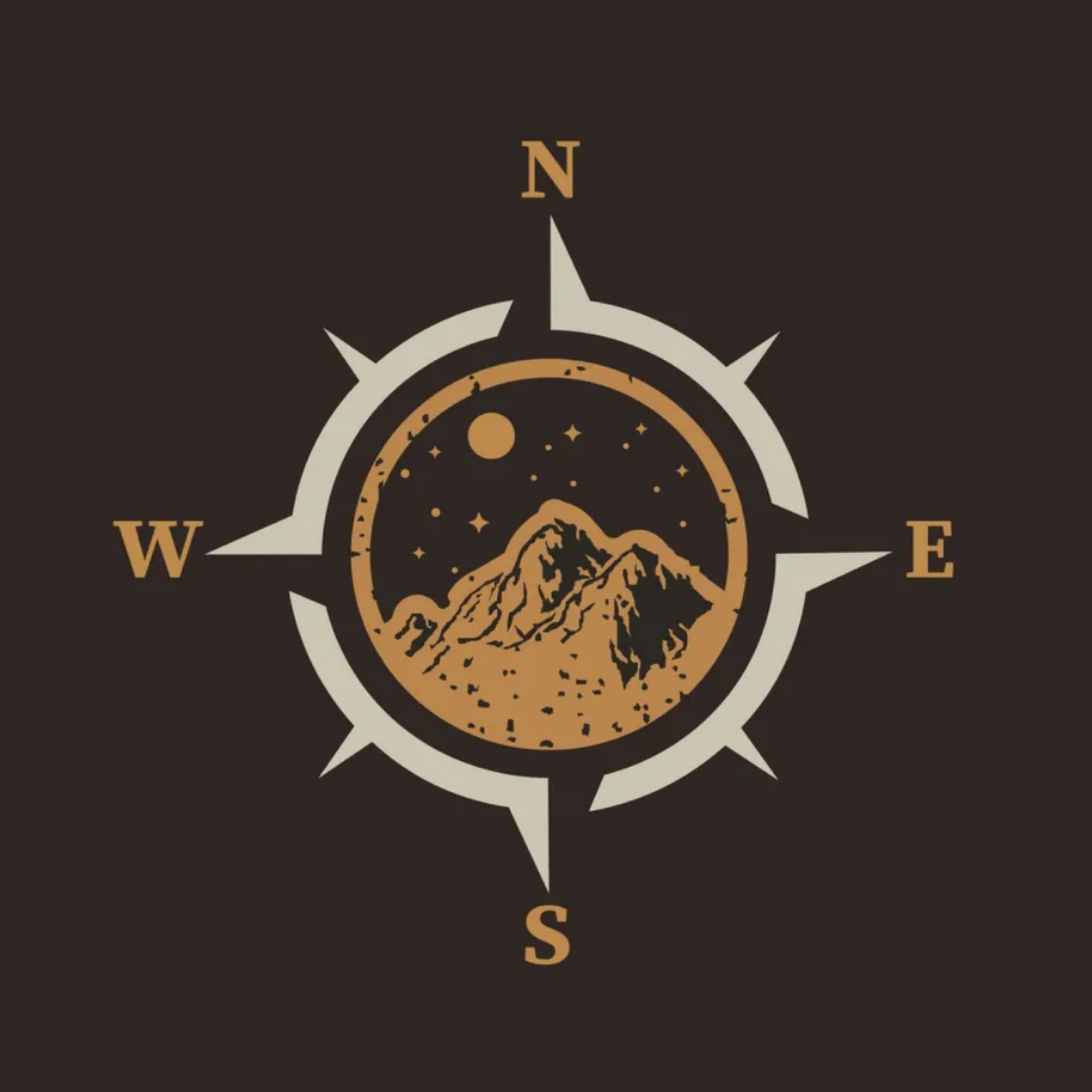
Adventure, but make it generic

Compasses and mountain icons show up a lot. They signal adventure, but not in a way that feels unique to any one brand.
Antlers shaped as fish hooks

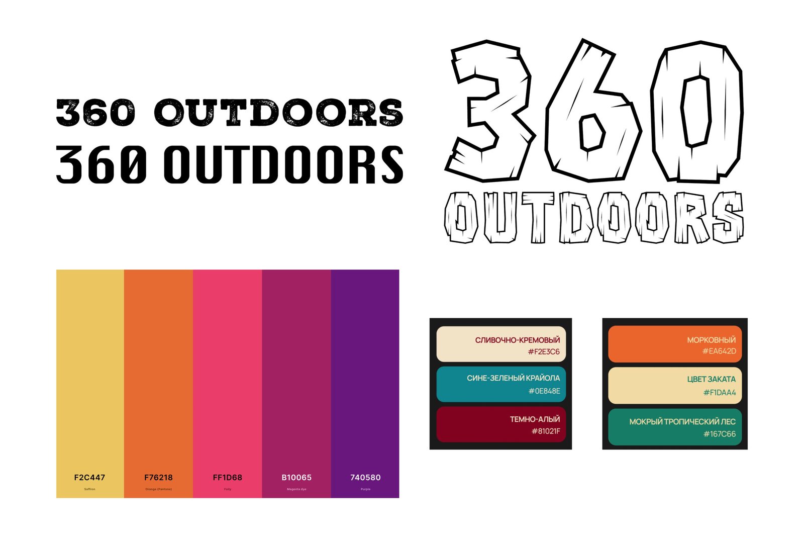
“Modern” but still the same

Even the cleaner, simpler logos are still using the same ideas underneath. Just stripped down versions of what already exists.
Deer head silhoette with target behind it

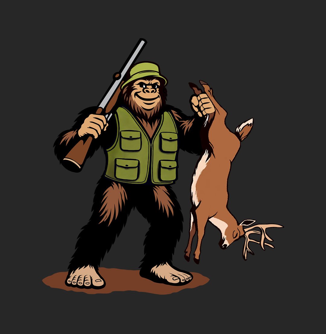
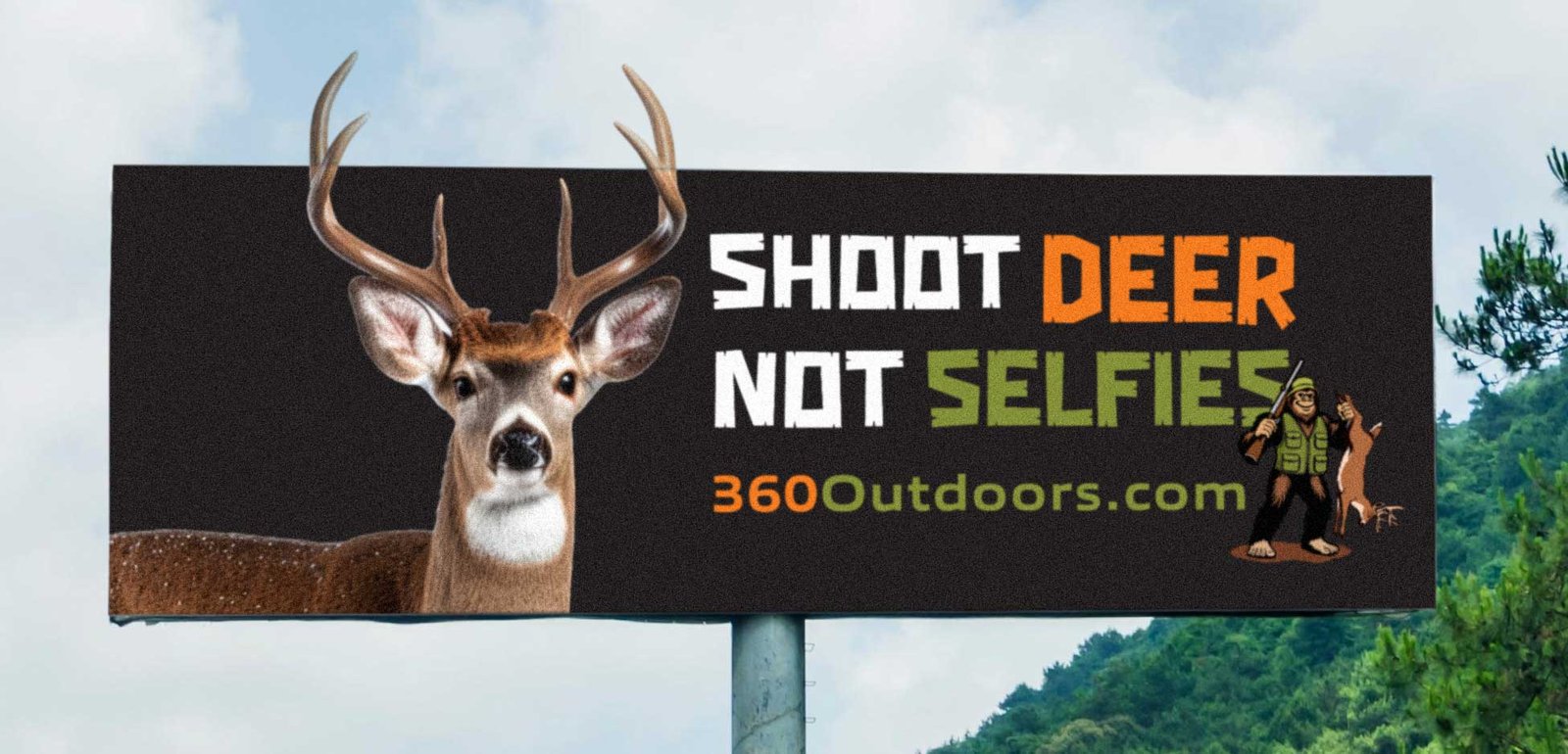
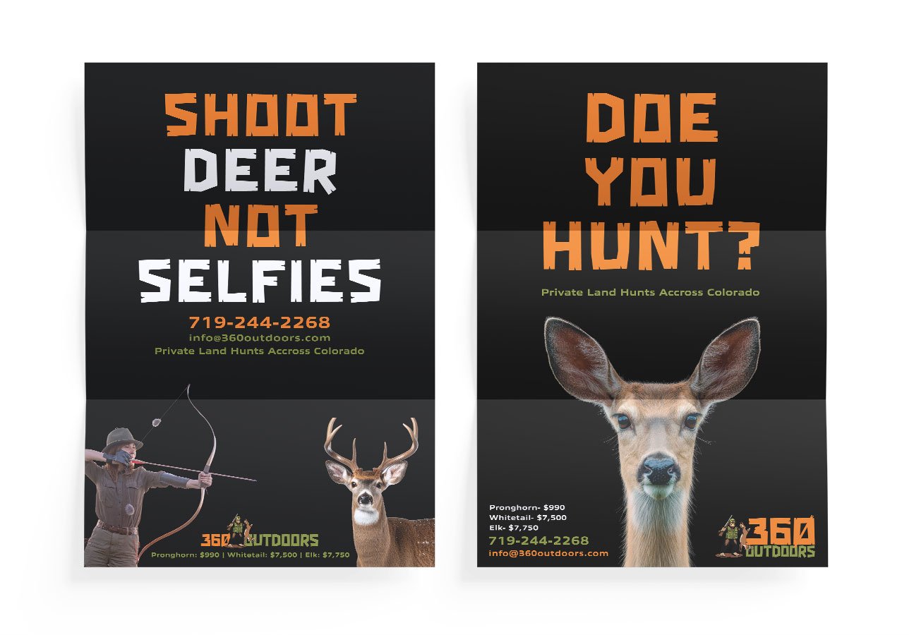
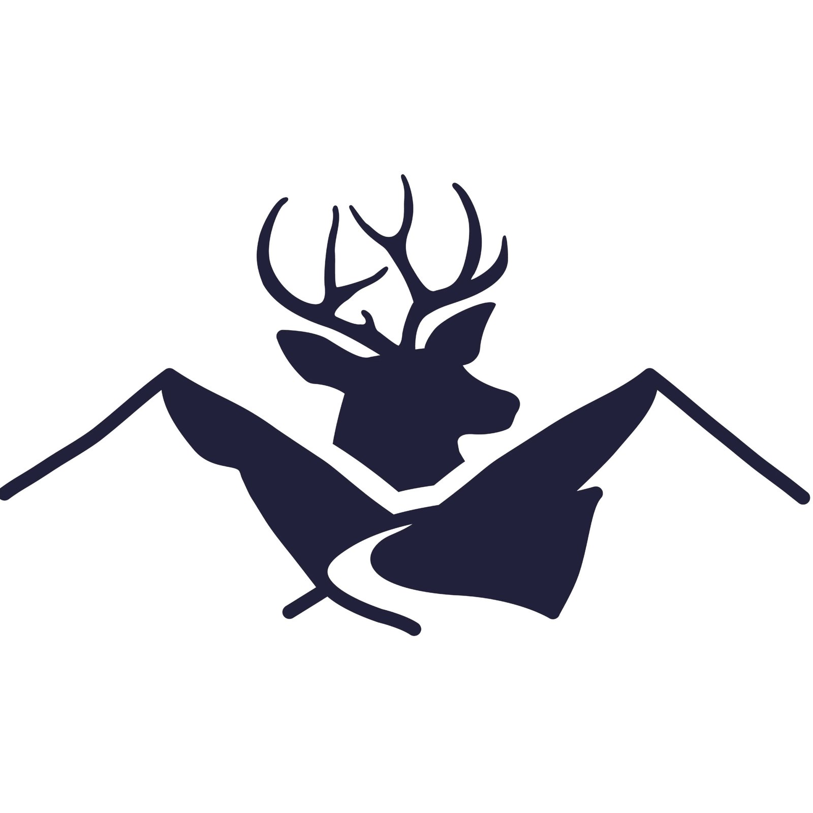
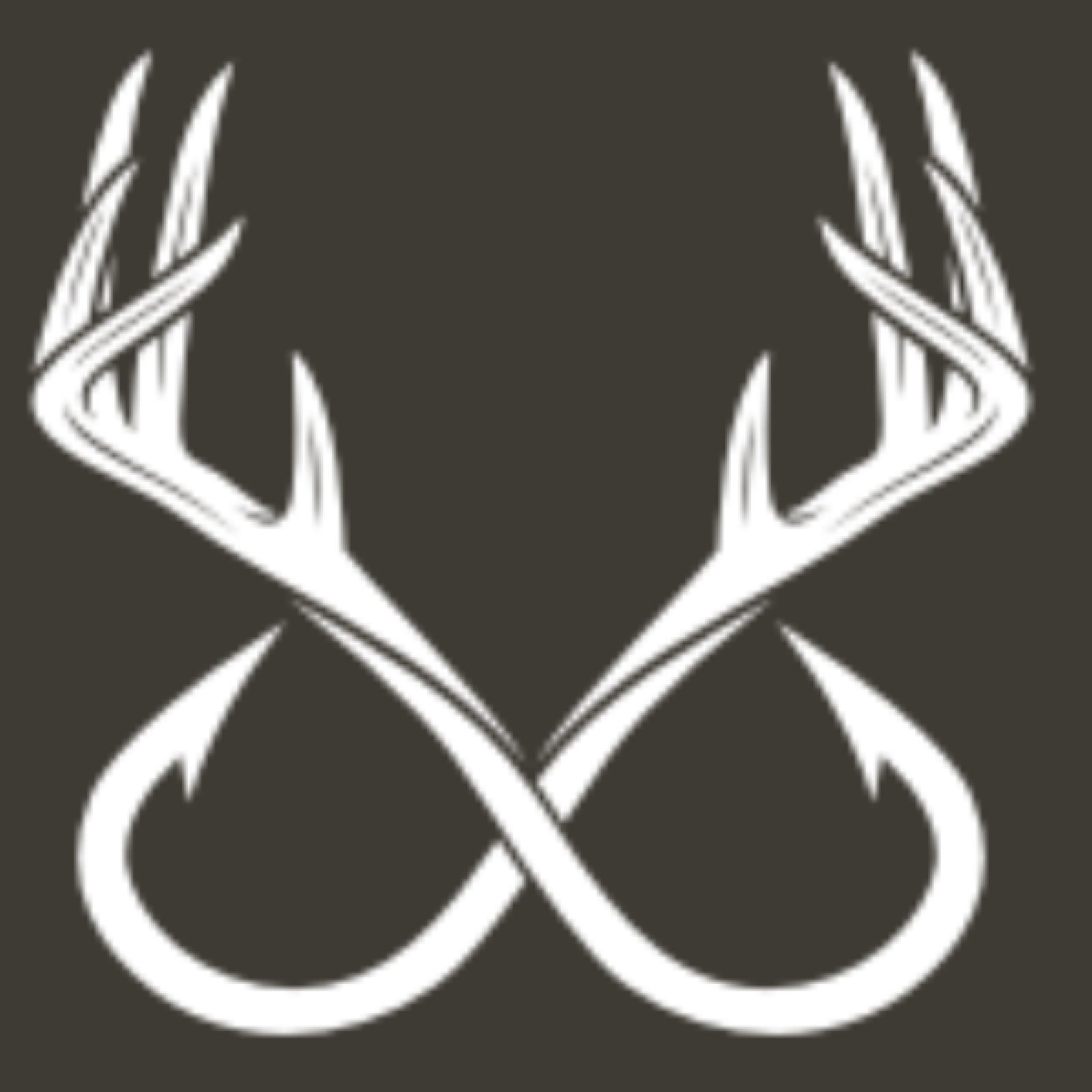
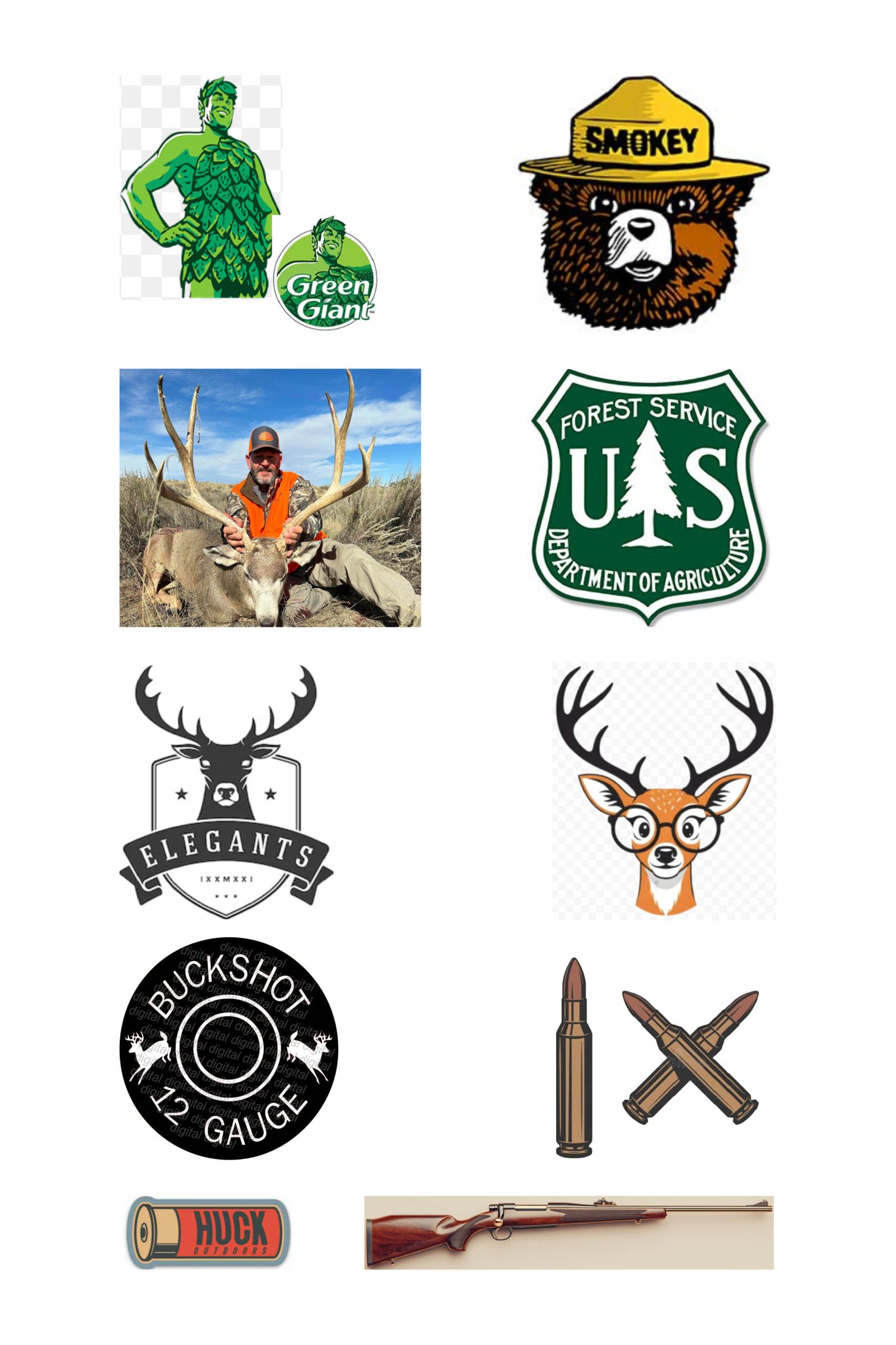
Are those deer antlers.... again?

Antlers are everywhere. Once you start noticing it, you can’t unsee how often the same symbol is reused.

Explorer

Freedom

Stability

Hero

Ego

Mastery

Built on Archetypes

This brand sits between two ideas. The pull to explore and the ability to follow through. One without the other doesn’t hold up. Exploration without direction can feel scattered, while skill without curiosity can feel rigid. The balance between the two creates something more grounded and believable. It shows up in how the brand feels. Open, but controlled. Approachable, but still capable.

MASCOT

VERTICAL

BADGE

HORIZONTAL

STICKER

How we get the word out

Final Gear

Putting the brand to work.

The Real World

Making a logo look good on a screen is one thing, but making it look good on a muddy truck or a favorite hoodie is where it really counts. For 360 OUTDOORS, I designed a set of merch that’s meant to be worn and used, not just sat on a shelf.
 
I focused on bold designs that stay legible from a distance, whether that’s on a hat in the field or a decal on a tailgate. Every piece was built with production specs in mind, ensuring the colors stay true and the graphics stay sharp on every material.